
Caption Styles That Fit Each Platform

Captions for TikTok, Instagram, and YouTube don't need a different style per platform, they need a different position. Each app stacks its own buttons over a different part of the frame, so the failure is almost never the font; it's caption text sliding behind TikTok's right-side column or under Reels' bottom bar. Keep one design, move the safe zone per app.
There is one more axis most guides skip: not every platform treats your captions the same way. YouTube reads caption text as searchable content and rewards an accurate native track; TikTok and Instagram mostly don't index it, so burned-in captions win there. This guide gives you the exact UI dead-zones in pixels, one centered box that survives every feed, the burned-in-versus-native call per platform, and the mistakes that quietly kill clips.
Do you need different captions for each platform?
No, you need the same caption style placed inside each app's safe zone, plus one decision about burned-in versus native captions that does change by platform. The look (font, size, color, animation) should stay consistent so your show reads as one account across feeds. What changes is where the text sits and which caption track each algorithm can actually read.
The reason this is a placement problem and not a design problem: a large share of social video is watched on mute, a figure put "as much as 85%" by Digiday back in 2016, with publishers in that same piece reporting anywhere from 50% to 90%, so treat it as a range, not a law. Either way, captions are close to mandatory, and the feeds keep getting denser as the same clips get reposted across every app. If your captions are unreadable on one platform because they're tucked behind a button, you've lost the clip on that platform regardless of how good the cut is.
The platform caption matrix: where each app covers the frame
Every short-form clip lives on the same 1080×1920 (9:16) canvas, but each app reserves a different slice of it for its own UI. Text in those reserved zones is gone, not cropped, just sitting under buttons the viewer sees and you don't. Here are the current reserved zones, in pixels, on that canvas.
| Platform | Bottom dead zone | Right-side button column | The zone that bites |
|---|---|---|---|
| TikTok | ~320px (caption, handle, audio disc) | heaviest of the three (like/comment/share/save/playlist stack) | Right edge, the densest UI |
| Instagram Reels | ~320px, and growing as the audio bar expands | ~120px (like/comment/share/menu) | Bottom, the audio-attribution bar keeps creeping up |
| YouTube Shorts | ~300px | lightest of the three | Most generous; fewest gotchas |
Sources: TikTok's text-safe area is roughly 1080×1420px on the 1080×1920 canvas, with the engagement stack weighting the right edge (Kreatli); Reels reserves about 320px from the bottom and 120px from the right (Minta). Shorts is the most generous of the three by consistent account across safe-zone guides. The honest caveat: these numbers drift every time an app ships a UI update, Reels' bottom zone, for one, grew by an estimated ~50px in late 2025 when the audio-attribution bar expanded, and they vary by device and whether that bar is showing. Treat them as a conservative floor, not a spec sheet, and always preview on the actual app, never just your editor's canvas.
The one caption layout that survives every feed
Center your caption block in a box roughly 900px wide by 1400px tall, sitting around the lower-middle of the frame, clear of the top bar, well above the bottom UI, and away from both side columns. That single rectangle is the most-restrictive common denominator across TikTok, Reels, and Shorts, so a clip built inside it reads correctly everywhere without per-platform repositioning (Minta).
This is the move that saves you the most time. Instead of nudging captions for each export, you design once for the tightest case and let the looser platforms have margin to spare. The center column is the only area no app's buttons reliably touch, TikTok's failure mode is right-aligned text that reads fine in your editor and then hides behind the button column on the live app, which never appears in a desktop preview (Kreatli).
A few specifics that make the box work in practice:
- Two lines, never more. A wall of text is unreadable on mute regardless of platform. One to two lines, sized so a viewer reads each beat before it changes.
- Large, high-contrast type. Big enough to read at arm's length on a phone, with a stroke or shadow so it holds against any background frame.
- Center-aligned horizontally. The only horizontally-safe zone across all three apps. Left- or right-anchored text is the single most common way captions vanish behind UI.
- Lower-middle, not bottom. Sit the block in the lower third of the safe box, not the bottom of the frame, that keeps it out of the bottom bar on Reels, which is the tightest.

Burned-in versus native captions: where each platform rewards you
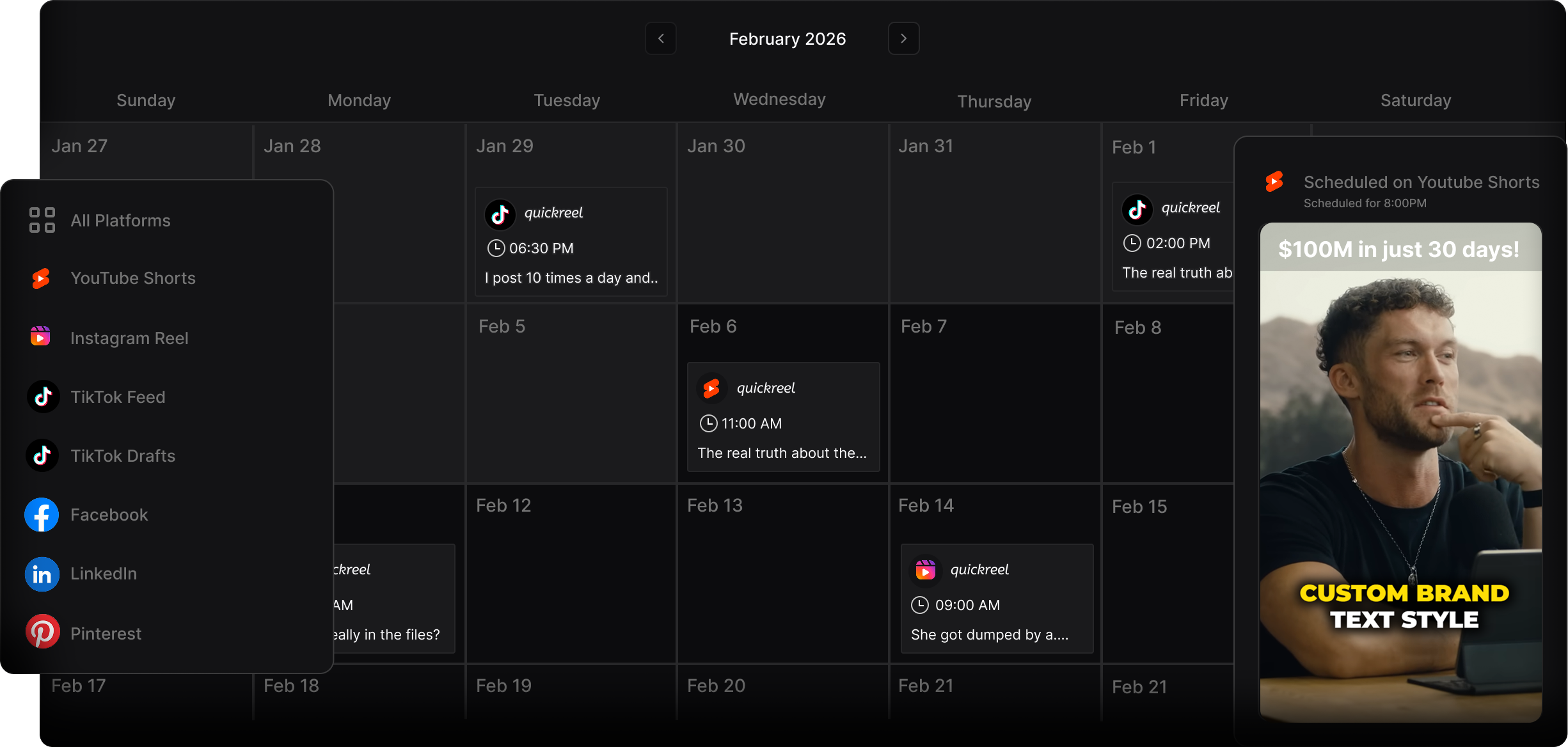
This is the axis that actually changes by platform. Burned-in (open) captions are baked into the video pixels, they show on every device, survive a download or re-share, and give you full styling control, but no algorithm can read them. Native captions are a separate text track the app generates or you upload; the viewer can toggle them, and on the right platform the algorithm can index them.
The split that matters: YouTube reads caption text as searchable content, so an accurate native track (an uploaded SRT) helps Shorts surface in search, caption accuracy is a discoverability factor there, not just a retention one (Opus, "YouTube Shorts caption best practices," 2026). TikTok and Instagram mostly don't index caption text for search the way YouTube does, and TikTok's own native auto-captions only render inside the TikTok app, not on desktop (TikTok Newsroom, "Introducing auto captions"). So on those two, burned-in is the safe default for styling and reliable display; on YouTube, burn in your styled captions and upload a clean SRT so you get the look and the search index.
The practical rule: always burn in your styled captions for the mute-watching majority, and add a native SRT only on YouTube. Don't rely on any app's auto-caption track as your visible captions, TikTok's native captions can't be edited after posting (you'd have to delete and re-upload), and auto-generated text mishears names, jargon, and homophones. Review the words before they ship; the clip-detection step and the captioning step are separate jobs, and the captions are where a sloppy export shows.
Common mistakes (and the fix)
- Designing in the editor's empty canvas. Your timeline shows a clean frame; the live app shows buttons on top. Fix: preview every clip against the actual app UI, or use a safe-zone overlay. The right-side column never appears in a desktop preview (Kreatli).
- Reusing an old caption template after a UI update. Reels' bottom dead zone crept up in late 2025 when the audio-attribution bar grew, so a pre-2025 template that cleared the old bar can now overlap it. Fix: re-check your safe box against the current app a couple of times a year, the platform-specs change tracker is worth a glance after any app update.
- Anchoring captions to the bottom of the frame. It looks balanced in your editor and disappears under the bottom bar on Reels and TikTok. Fix: sit the block in the lower-middle, inside the 900x1400 box.
- Treating YouTube like TikTok. Burning in captions and skipping the SRT throws away YouTube's search index. Fix: on Shorts, burn in and upload a corrected SRT.
- Restyling per platform instead of repositioning. Different fonts per app make one show look like five accounts. Fix: keep the style identical; only move the safe zone. Consistency is part of how a feed recognizes you, the same discipline that helps you pick the best AI-suggested clips applies to caption setup.
FAQ
Should captions look different on TikTok versus Instagram versus YouTube?
No, keep the same font, size, and color so your show reads as one account everywhere. What changes is placement (each app reserves a different part of the frame) and whether you add a native caption track. Design one style inside the universal-safe box, then add an SRT only on YouTube for search.
Where exactly should captions sit to be safe on all three apps?
Center them horizontally and place the block in the lower-middle of a roughly 900px-wide by 1400px-tall box centered in the 1080×1920 frame (Minta). That clears TikTok's right-side button column, Reels' bottom bar, and Shorts' lighter UI at once, so one export works on every platform.
Are burned-in captions bad for YouTube?
No, but they're incomplete. Burned-in captions give you styling and survive re-shares, yet YouTube can't read the text for search. On Shorts, burn in your styled captions and upload an accurate SRT so the algorithm indexes the words (Opus). On TikTok and Instagram, burned-in alone is fine because they don't index caption text the same way.
Do I still need captions if a platform has auto-captions?
Yes, auto-captions are limited and inconsistent. TikTok's native track renders only inside the app, not on desktop, and can't be edited after posting (TikTok Newsroom). Auto-generated text also mishears names and jargon. Burn in your own reviewed captions for the mute-watching majority and use native tracks as a supplement, not the main event.
How often do these safe zones change?
Often enough to re-check twice a year. Reels' bottom zone grew in late 2025 with the larger audio-attribution bar, and TikTok and Instagram both keep adding UI that eats into the frame (Kreatli; Minta). The numbers here are a conservative floor, when in doubt, give yourself more margin and preview on the live app.
For platform-specific cut and format details beyond captions, see the guides on cutting podcast clips for TikTok, formatting Reels for podcast clips, turning episodes into YouTube Shorts, and posting clips on LinkedIn.