
Cover Frames & Thumbnails That Fit Each Platform


Set one vertical cover at 1080 × 1920 with your face and any text inside the center band, then check it in two places: the in-feed full-screen view and the browse surface that collects your clips, the Instagram profile grid, the YouTube Shorts shelf, or a channel page. The cover that wins reads at both sizes. A Reels cover is the same image cropped three ways; a Shorts thumbnail is a separate, search-facing asset you upload on its own.
The mistake that quietly costs clips is treating the cover as one picture for one place. It is one image that gets re-cropped per surface, and the surfaces disagree on the crop. This guide gives you the exact crops each platform takes, a text-on-cover safe box that survives all of them, and the rule for which frame to grab in the first place.
Why the cover frame decides whether a clip gets opened
A clip's cover is the only thing a person sees before they spend a second of attention. On feed-first surfaces, the TikTok For You page, the Reels tab, the video auto-plays, so the first frame of motion does the selling and the cover matters less. On every browse surface, the still cover is the entire pitch. The Instagram profile grid, the YouTube Shorts shelf, search results, and a channel page all show a frozen thumbnail and wait for a tap.
That browse layer is not a side door. For older Shorts, the channel grid, the desktop Shorts shelf, and search are where most discovery and re-watching happen, the swipe feed surfaces a Short once, then those static placements keep earning clicks (vidIQ). And this matters because clips are how new people find a show in the first place: short-form clips drive an estimated 20–40% of new audience for video podcasts and can lift reach 2–5× (Podcast Studio Glasgow). A cover that's a frozen mid-blink wastes that traffic on the surfaces where the picture does the work.
Reels cover vs Shorts thumbnail: they work differently
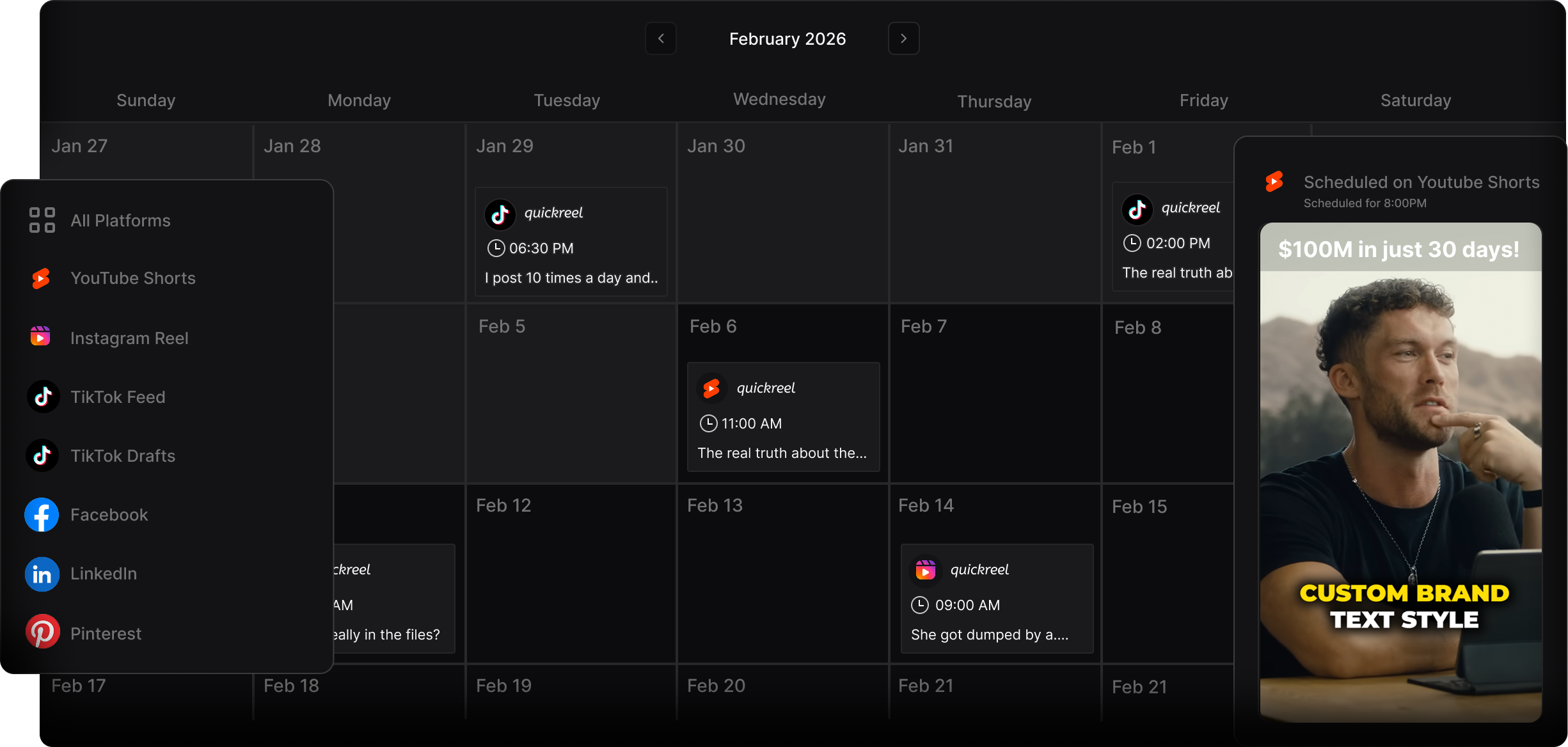
A Reels cover and a Shorts thumbnail are not the same kind of asset, and confusing them is where most clips lose the click. The Reels cover is one frame stretched across feed and grid; the Shorts thumbnail is a separate, upload-once image aimed mostly at search and browse. Here is the practical breakdown.
| Surface | What the cover is | The crop / spec that bites |
|---|---|---|
| Instagram Reels | One cover image; same frame in feed and grid | Grid now crops to 3:4; in-feed preview to 4:5, center everything (Instagram Help) |
| YouTube Shorts | A separate thumbnail you upload in Studio | Never shown in the swipe feed; appears on the shelf, search, channel grid (vidIQ) |
| TikTok | A cover frame chosen from the clip + optional text | Cover shows on your profile grid; feed plays the video, not the cover |
| First frame / chosen still on a mostly-desktop feed | Many viewers see it muted on desktop, a clear still earns the play (LinkedIn Help) |
Two specifics are worth pinning down because the platforms changed them recently. Instagram moved its profile grid from the old 1:1 square to a taller 3:4 preview in early 2025, Adam Mosseri said most content shared is bigger than a square, so the square was cropping it (Buffer). And YouTube rolled out true custom Shorts thumbnails through desktop Studio across most accounts during 2025, so you no longer have to bake the cover into the first frame of the video (vidIQ).
The text-on-cover safe box (the rule that survives every crop)
If you put a title on your cover, and you usually should, keep it inside a center safe box: the middle 80% horizontally, and clear of the top 12% and bottom 25% vertically. That single box survives the Instagram 3:4 grid crop, the 4:5 in-feed crop, and the Shorts shelf's UI overlays at once. It is the closest thing to a universal cover rule there is.
The numbers behind it: design the cover at 1080 × 1920 and keep critical elements centered (Later). Instagram's profile grid now trims that frame to 3:4 (Buffer) while the home feed trims it to 4:5, so text near any edge gets cut. For YouTube Shorts, vidIQ recommends keeping the design inside a safe zone with roughly 380 px clear at the top and bottom of a 1080 × 1920 frame (about a fifth at each end), where titles, the channel name, and player chrome sit (vidIQ). Overlay those constraints and the surviving area is the box below.
Two craft notes that beat any spec. Keep cover text to three to five words, a thumbnail at grid size is the width of a thumbnail, and a sentence turns to gray mush. And make the words a promise the clip pays off, not a topic label: "He almost quit at episode 7" beats "Episode 47 highlights."

How to set the cover, step by step
The mechanics differ per platform, but the order is the same: grab a sharp frame, center the message, then verify on the browse surface before you walk away.
- Pick a frame with an open face and a clear expression. Avoid mid-blink, mid-word mouth shapes, and motion blur. A face looking toward the camera, slightly off-center, reads best at thumbnail size. If the best talking moment has a bad frame, scrub a half-second either way.
- On Instagram, set the cover and check the grid tab. On the final upload screen, tap Edit cover, scroll to a frame or upload a custom 1080 × 1920 image, then switch to the Profile grid preview and adjust the crop so nothing important is clipped at 3:4 (Later). You can change a cover after posting, so a weak one is fixable.
- On YouTube Shorts, upload a real thumbnail in Studio. Open the Short in YouTube Studio, find the Thumbnail field, and upload a custom image rather than relying on the auto-frame, this is the asset that earns clicks on the shelf and in search (vidIQ). If your account doesn't show the desktop upload yet, use the mobile app or bake the cover into the first frame.
- On TikTok and LinkedIn, choose the still, keep it clean. TikTok lets you select a cover frame and add cover text that shows on your profile grid; pick a frame that holds up small. On LinkedIn, where much of the feed runs on desktop with sound off, a clear opening still with one readable line earns the play (LinkedIn Help). (More on that sound-off reality in our guide to podcast clips on LinkedIn that get watched.)
- Verify on the browse surface, not just the preview. Look at your own profile grid and, for Shorts, the channel page. If you can't read the cover text or tell who's talking at that size, it's too busy. Shrink the file to its grid size on screen and judge it there.
Common mistakes that flatten your click-through
These are the errors I see most when reviewing a batch of finished clips. Each one is cheap to fix.
- Putting the title at the top or bottom edge. That's exactly where the Instagram grid trims to 3:4 and where the Shorts shelf UI sits (Instagram Help; vidIQ). Move it into the safe box.
- Letting YouTube auto-pick the Shorts frame. The default is whatever frame the encoder grabbed, often a transition or a blur. A custom thumbnail with a readable face and a few words is the asset that earns the click on search, the shelf, and your channel grid, the surfaces where the thumbnail, not the swipe feed, decides whether the Short gets opened (vidIQ). Upload a real one.
- Reusing one cover identically across platforms without checking the crop. The same image is fine; assuming the crop is the same is not. Instagram's 3:4 grid, the Shorts shelf overlays, and TikTok's profile tile each clip different edges.
- Cover text longer than five words. At grid size it's unreadable. If you need a full sentence, it belongs in the caption, not the cover.
- A cover that doesn't match the hook. If the cover promises drama and the first three seconds are a slow intro, watch time tanks and the platform stops showing it. The cover and the opening have to agree, see how AI clip detection finds the strong moment.
The tools: pick a frame by hand, or start from a centered one
By hand, the workflow is straightforward but slow: export the clip, scrub for a clean face frame, add a 3–5 word title inside the center band, then set it per platform and verify on the grid. Figure 30–60 seconds of cover work per clip on top of the edit, manageable for one clip, a tax across a week of them.
A clipping tool removes most of that. When the clip comes out already framed 9:16 with the speaker centered, the cover frame is half-solved: any moment you freeze already keeps the face in the safe box. QuickReel does this, and so do alternatives like Opus Clip, 2Short, and Klap. The honest framing is that most modern tools detect roughly the same strong moments, so the real difference is how few clicks sit between a link and a posted clip, including how easily you can set a cover. Whichever you use, still eyeball every cover before posting: confirm the face frame is sharp and the title clears the edges. AI is an accelerant here, not a replacement for the 10-second human check. To make that check faster, see how to pick the best AI-suggested clips.
FAQ
What's the difference between a Reels cover and a Shorts thumbnail? A Reels cover is one image Instagram shows in both the feed and the profile grid, cropping it to 4:5 and 3:4 respectively, so you center everything. A Shorts thumbnail is a separate image you upload in YouTube Studio that never appears in the swipe feed, it shows on the Shorts shelf, search, and your channel grid, where it earns clicks.
What size should a clip cover or thumbnail be? Design at 1080 × 1920 (9:16) so it matches the vertical clip and you control the crop. Keep titles and faces inside the center safe box, roughly the middle 80% horizontally, clear of the top 12% and bottom 25%, so the image survives Instagram's 3:4 grid crop and the YouTube Shorts shelf overlays at once.
Does Instagram still crop the grid to a square? No. Instagram moved the profile grid from a 1:1 square to a taller 3:4 preview in early 2025, because most content people post is taller than a square (Buffer). Design your cover with the subject centered and it survives both the 3:4 grid and the 4:5 in-feed crop.
Do Shorts thumbnails actually matter if they don't show in the feed? Yes, on the surfaces where older Shorts get discovered. The thumbnail appears on the Shorts shelf, in search, in suggested rows, and on your channel page, the places people browse rather than swipe. The swipe feed autoplays and hides the thumbnail; everywhere else, the still image is what earns the click (vidIQ).
Can I change a cover after I post the clip? On Instagram, yes, open the Reel's menu, tap Edit cover, and pick a new frame or upload an image (Later). On YouTube, you can swap a Short's thumbnail in Studio. So a weak cover on an early post is worth fixing, not abandoning.
Related guides: Instagram Reels specs and format for podcast clips, turning podcast episodes into YouTube Shorts, and cutting podcast clips that work on TikTok.