
Brand Template for Podcast Clips: One Look, Every AI Clip

Set your look once, then make it the default. Build a brand template that locks five things, your caption font, your caption style, one or two brand colors, where your logo sits, and the platform safe zones the captions live inside, and apply it to every AI clip batch so each export comes out matching without you touching it. The whole point is that you configure it a single time and the next 30 clips inherit it automatically.
Most creators do the opposite. They generate a batch, then hand-style each clip, a different font here, the logo too big there, captions that drift over the platform's own buttons. That's slow, and worse, it makes a show look like five different shows in someone's feed. Consistency is what turns a clip viewer into someone who recognizes you the second time. And clips are doing real acquisition work: one production studio estimates short-form clips drive 20–40% of new-audience growth for video podcasts and can lift reach 2–5× (Podcast Studio Glasgow; single-studio figures, treat as directional). A recognizable look compounds that.
If you want the upstream context, how the tool picks the moments before it styles them, how AI clip detection actually works covers that. This guide is about what happens after: making every one of those clips look unmistakably yours.
What is a brand template for podcast clips?
A brand template is a saved set of styling rules, font, caption style, colors, logo, and layout, that an AI clip tool applies to every clip it generates, so you never re-style by hand. Define it once and each new batch inherits it: a 30-clip episode comes out visually identical instead of needing 30 manual passes.
Think of it as the visual equivalent of a CSS stylesheet for your clips. Change the template, and every future clip changes with it. Leave it alone, and your feed stays coherent for months.
How to lock your brand across every AI clip
Here's the build order. Do it once, top to bottom, and save it as your default template before you generate a single batch.
1. Pick one caption font, and one weight
Choose a single sans-serif typeface in a heavy weight, something legible at a glance on a 6-inch screen. Bold or semibold, never light. The most common branding mistake is mixing two fonts in one clip; it reads as amateur and it fights for attention with your actual words. One font, one weight, applied to every clip. That alone makes batches look intentional.
Resist decorative or condensed fonts. They photograph badly under motion and shrink poorly. Your caption font's only job is to be read in under a second.
2. Set the caption style, not just the font
Style is the part beyond the typeface: the active-word highlight color, the size, the casing, and whether words pop in one at a time or appear as full lines. Pick one and commit. QuickReel ships 12+ caption styles (QuickReel pricing), choose the one that matches your show's tone and lock it. The retention-helping choice is usually a large, high-contrast caption with a single highlighted active word. We'll get to which styles help versus hurt below.
3. Choose one or two brand colors
A highlight color for the active caption word, and a readable base (white or near-black) for the rest. That's it. A third color is almost always clutter. Use your existing show palette so the clips match your channel art and thumbnails, recognition across surfaces is the goal. If your brand color is low-contrast against video (pale yellows, mid-grays), keep it for the logo and use white captions with a subtle stroke instead.
4. Place a small logo in one corner, out of the way
A logo earns recognition only if it's consistent and unobtrusive. Small, one fixed corner, every clip. Top-left or top-right, away from where the caption band sits and away from the platform's own UI. A logo that covers the frame or moves around per clip does the opposite of branding, it distracts and dates the clip. The point is a quiet, repeated mark, not a watermark that fights the content.
5. Respect the platform safe zones
This is the step almost everyone skips, and it's where good branding goes invisible. TikTok, Reels, and Shorts each layer their own buttons, captions, and username over the bottom and right of the frame. Anything you place there gets covered. Keep captions in the middle third and logos in the top corners, and your branding survives on every platform without per-platform re-edits.
Save all five as your template. From here, generation handles the rest.
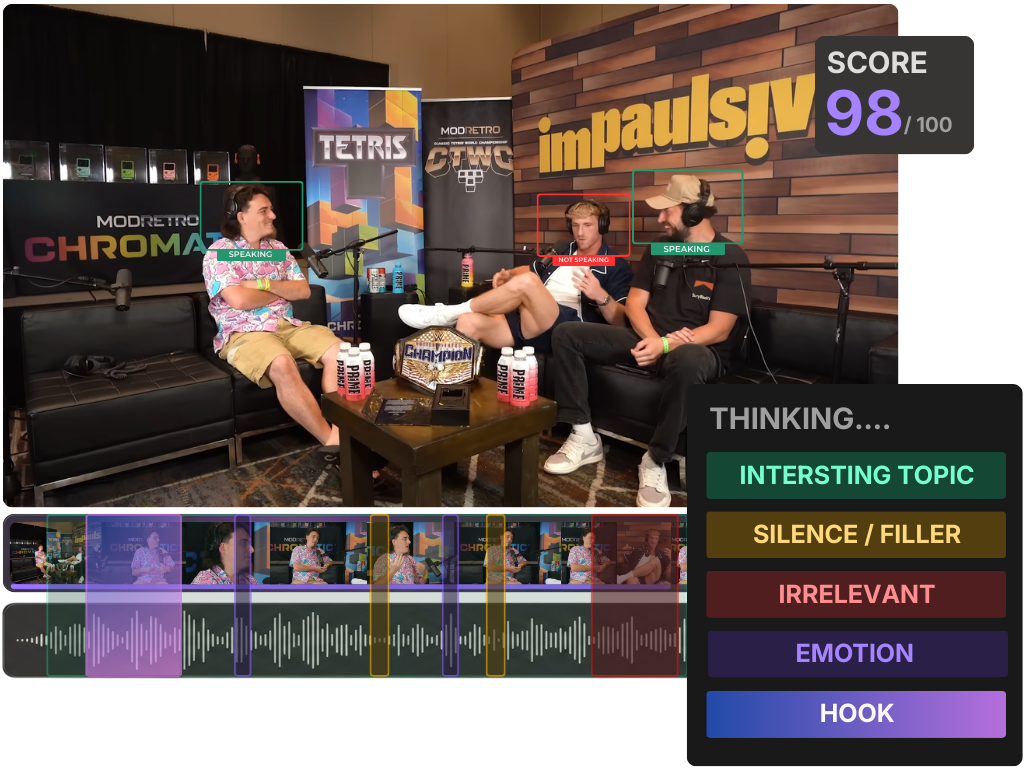
Template choices that aid retention vs. ones that just look busy
This is the part most "brand kit" advice skips. A template can be perfectly consistent and still kill watch-time if the choices fight the viewer. Branding and retention are not the same goal, and where they conflict, retention wins, a forgettable clip that gets watched beats a beautiful one that gets scrolled past.
The mechanism is simple: a large share of social video is watched sound-off, so the captions are the content for most viewers. (Mute-viewing is widely cited at 75–85%; Verizon Media/Sharethrough reported ~75% and Digiday reported ~85% of Facebook video muted, both publisher-reported and directional, so treat the band, not a single number.) If your template makes captions hard to read fast, you lose the people you were trying to reach.
The pattern: pick the choices on the left, lock them, and stop. Heavy per-word animations and multi-color text feel "designed" but they slow reading and pull the eye off the speaker. A clean, large caption with a single highlighted word is what holds people, and it happens to be the easiest thing to keep consistent. A consistent look also won't rescue a weak moment: a polished template on a clip the tool over-rated still flops, which is why what an AI virality score really tells you is worth a read before you trust the order. Once your template is right, your retention work moves to where it belongs: choosing clips that stand alone and hook fast, which picking the best AI-suggested clips walks through.
Common mistakes when branding AI clips
- Re-styling each clip by hand. If you're touching the font or logo on individual clips, your template isn't doing its job. Fix it at the template level and regenerate so all 30 clips update at once. Hand-styling at the clip level is how branding drifts.
- Putting captions in the bottom of the frame. It looks natural in your editor and then disappears under TikTok's caption and Reels' username in the live feed. Keep text in the middle third every time.
- Using two fonts or four colors. More type and color feels like effort and reads as noise. One bold font, one highlight color, a readable base. Restraint is the brand.
- A logo that's too big or moves. A large or animated logo distracts from the hook in the first three seconds, the exact window that decides whether someone stays. Small, fixed, one corner.
- Forgetting the template across formats. If you also cut suspense-driven or narrative clips, the safe zones and exit framing still apply, where to end a clip for maximum suspense matters more than logo placement, but both should ride the same template so the whole feed reads as one show.
Tools: where templates apply automatically
You can brand clips in any editor, but doing it by hand per clip is the slow path. The win comes from a tool that applies the saved template at generation, so a 30-clip batch comes out styled without a second pass, and re-applies it the next episode, and the one after that. QuickReel saves brand templates and applies your font, caption style, color, and logo to every clip it generates; the number of distinct templates you can save scales with the plan, 1 on Starter, 3 on Pro, 5 on Pro+, unlimited on Ultimate (QuickReel pricing), which matters if you run more than one show or sub-brand. If you're styling a whole back catalog at once, batch-clipping a full episode in one pass covers applying a template at volume.
Opus Clip, Vizard, and Klap all support brand or caption presets too; the five-element lock list above applies to their templates without changes. The tool matters less than whether you actually set the template once instead of restyling forever.