
Captions for Podcast Clips on LinkedIn

Caption your podcast clips for LinkedIn the way you'd dress for the room: clean, legible, and a register quieter than TikTok. Use a plain heavy sans-serif, two lines at most, no bouncing word-by-word animation, and keep the text out of the very bottom where LinkedIn's player controls sit. Then either burn the captions in or upload an SRT file, LinkedIn natively supports both, and most clips do best with both.
The mistake people make is reusing their TikTok caption preset on LinkedIn unchanged. The colored, jumping, emoji-studded "karaoke" style that reads as energetic on a TikTok feed reads as gimmicky in a feed of hiring updates and conference recaps. LinkedIn rewards substance signaled calmly. This guide covers the tone, the exact style settings, where to put the text, and the part most tutorials skip entirely, LinkedIn's SRT subtitle upload, so a single clip can play silent on autoplay and stay accessible with captions toggled on.
Why captions decide whether a LinkedIn clip lands
On LinkedIn, the caption is the clip. Video autoplays muted in the feed, and most people are scrolling at a desk between meetings, in an open office, or on a phone they'd rather not blast audio from. A widely repeated estimate puts around 85% of social video viewed with the sound off (Digiday, from 2016 publisher-reported data), treat that as directional, not a precise current figure, since individual studies range from roughly 69% to 85% and the original number is a decade old. The platform changed; the behavior didn't. A LinkedIn clip with no captions is a clip almost no one hears.
That matters because clips are how a professional show gets discovered in the first place. One studio's client data puts clips at 20–40% of new audience, with reach lifts of 2–5× for video shows (Podcast Studio Glasgow), one source's directional range, not a platform-wide audit. And social clips now outrank friends as a discovery channel: 57% of listeners rely on social media for podcast recommendations, the first time it surpassed friends and family (InsideRadio). For a B2B or interview show, LinkedIn is where a lot of that discovery happens, and it only happens if the silent, scrolling viewer can read what's being said.
The LinkedIn register: restrained, not lifeless
The whole game on LinkedIn is matching the room. The audience is decision-makers, operators, and peers, and the feed sets a calmer baseline than TikTok's. Your captions should read as edited, not as a party. That does not mean boring, it means deliberate.
Concretely, here is what "restrained" means in settings:
- Show full phrases, not one word at a time. The bouncing single-word karaoke style is built for hyperactive feeds. On LinkedIn, show one to two lines of the actual sentence so a skimming reader gets the point in a glance.
- One color, high contrast. White text with a dark outline or a subtle dark box behind it. Skip the neon and the per-word color swaps. If you must highlight, highlight one keyword per line, not every word.
- A plain, heavy sans-serif. Inter, Helvetica, a clean Geist-style face. Avoid the rounded "fun" display fonts and anything condensed to the point of straining at small sizes. The font does a lot of the credibility work, choosing a caption font built for small screens covers what actually reads on a phone.
- No emoji in the caption track. Save them for the post copy if you use them at all. In the burned-in caption, they date the clip and undercut the tone.
- Punctuation and proper capitalization. Lowercase-everything reads as casual-platform default; sentence case reads as edited. On LinkedIn, edited wins.
The exact style and placement settings
Tone is the strategy; these are the dials. Set them once, save a "LinkedIn" preset, and apply it to every clip headed there.
| Setting | LinkedIn value | Why |
|---|---|---|
| Lines on screen | 1–2, full phrases | Skimmable; reads as edited, not as a transcript |
| Font | Heavy sans-serif (Inter / Helvetica) | Legible at a glance, professionally neutral |
| Color | White + dark outline/box | Survives any background; no neon |
| Vertical placement | Middle-to-upper third | Player controls cover the bottom on autoplay |
| Animation | Static or gentle fade | No per-word bounce; calm register |
| Aspect ratio | 1:1 or 4:5 (square / portrait); 9:16 also supported | Square and portrait take the most feed space; vertical plays natively |
Two of those deserve a note. Placement matters more on LinkedIn than people expect: the in-feed player overlays a progress bar and controls across the bottom strip, and on desktop the post text sits directly beneath the video. Put captions in the middle-to-upper third and nothing covers them. Aspect ratio is more forgiving than people assume, LinkedIn supports vertical, square, and portrait natively, so a 9:16 clip plays full-frame without letterboxing. Square (1:1) and portrait (4:5) still tend to command the most feed real estate on desktop, so reframe to one of those when you can, but a vertical clip is not penalized.
The SRT route: LinkedIn's built-in subtitle upload
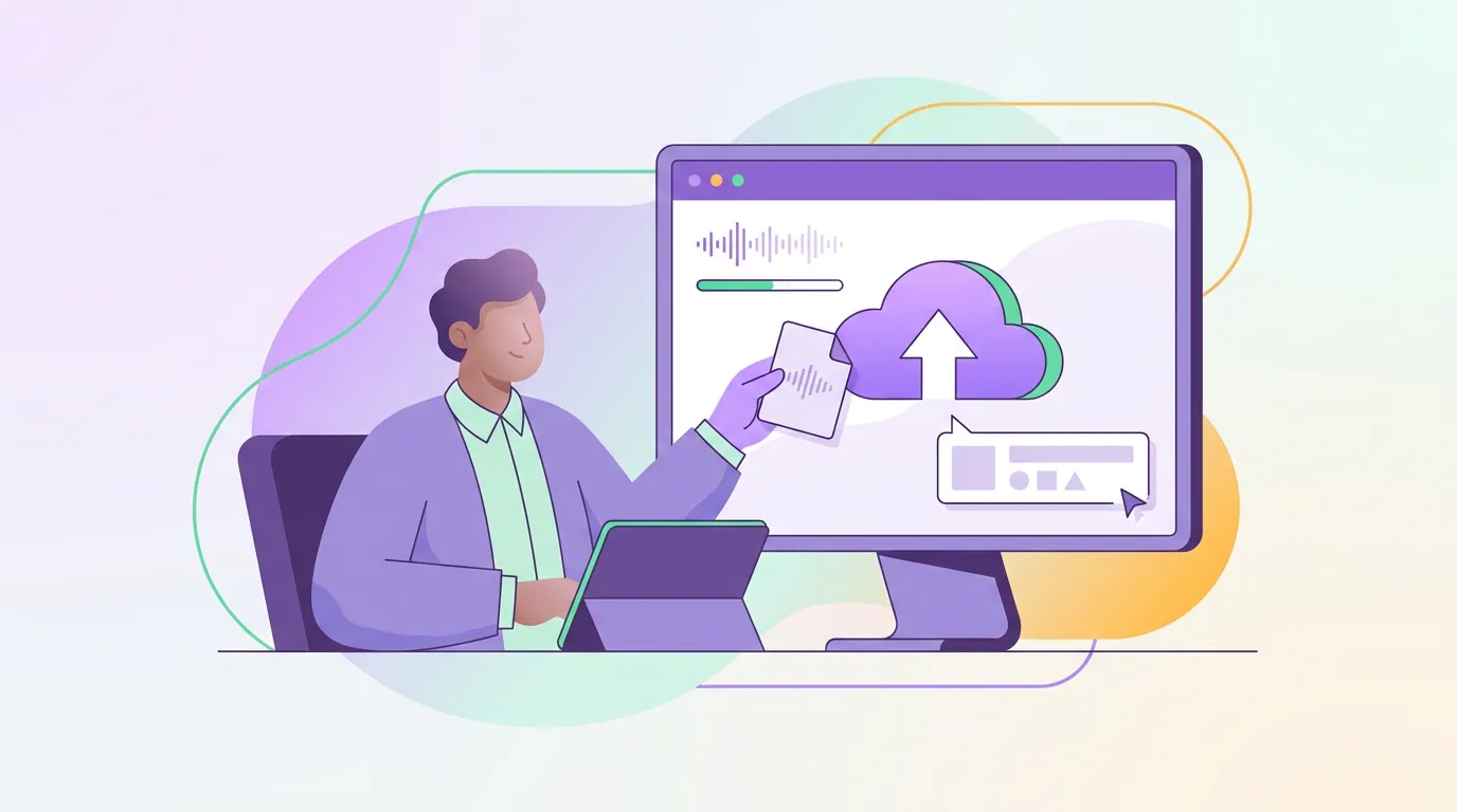
Here is the part the TikTok-first tutorials skip. LinkedIn lets you attach a separate subtitle file to a native video, an SRT, so viewers can toggle captions on or off. That is different from burning captions into the pixels. Both routes work on LinkedIn; the smart move for most clips is to use both.
The reason to do both: burned-in captions guarantee that the silent autoplay viewer sees text styled exactly the way you intended, regardless of device or settings. The uploaded SRT adds an accessible, toggleable track that screen readers and caption-preference users can use, and gives viewers who want a cleaner frame the option to switch it off. The deeper tradeoff between the two, and when burned-in alone is enough, is in burned-in vs soft captions for podcast clips.
To upload the SRT when you post a native video to LinkedIn, attach the file in the same dialog where you add the video, before publishing. A few practical notes:
- Name the file with a language code. LinkedIn expects the subtitle file named with a recognized language tag (for example, ending in
_en.srtfor English) so it labels the track correctly. - Export the SRT from the same transcript you captioned with. If you burned in captions from an AI transcript, export an SRT from that exact transcript so the two tracks match word for word. Mismatched tracks look careless.
- Add the SRT before you publish. Uploading subtitles is part of the native-video post flow; do it at posting time rather than trying to bolt it on after the clip is live.
If you want the full mechanics of generating, correcting, and exporting that transcript in the first place, the end-to-end pipeline is in how to add captions to podcast clips. LinkedIn is the same five steps, transcribe, style, sync, burn in, export, with a quieter style preset and an SRT export at the end.
Common mistakes when captioning for LinkedIn
Reusing the TikTok preset unchanged. The bouncing, colored, emoji-laden style that reads as native on TikTok reads as trying-too-hard on LinkedIn. Build a separate, calmer preset and keep them apart.
Treating aspect ratio as an afterthought. LinkedIn plays vertical, square, and portrait natively, so a 9:16 clip is not letterboxed, but square (1:1) and portrait (4:5) usually take up more of the feed on desktop. Pick the ratio deliberately and frame your captions for it before you style them.
Captions in the very bottom third. The player controls and, on desktop, the post copy sit right below the video. Middle-to-upper third keeps text clear of both.
Trusting auto-captions blindly on jargon. Auto-transcribers reach word accuracy in the low-to-mid 90s on clean, single-speaker audio in vendors' own benchmarks, but the misses cluster on company names, titles, and industry terms, the exact words a professional audience will notice. Review those, every time. Why the errors cluster there, and how to fix them efficiently, is covered in auto vs manual captions: which is worth it.
Skipping the SRT. Burned-in alone works, but the uploaded subtitle track is free accessibility and a second discovery surface. Leaving it off is leaving value on the table on the one platform that natively supports it.
Captioning the wrong clip. Restrained captions can't save a clip that has no payoff. Pick the moment first, a clear claim, a contrarian take, a useful number, then caption it. How the moment gets chosen is in how to pick the best AI-suggested clips and how AI clip detection actually works.
FAQ
Does LinkedIn support uploading SRT subtitle files? Yes. When you post a native video to LinkedIn, you can attach an SRT subtitle file in the same upload dialog, and LinkedIn displays it as a toggleable caption track. Name the file with a recognized language code (for example ending in _en.srt) and add it before you publish.
Should LinkedIn captions be burned in or an uploaded SRT? Use both for most clips. Burn captions into the pixels so they show on muted autoplay exactly as styled, and also upload an SRT for an accessible, toggleable track. Burned-in covers the silent scroller; the SRT covers accessibility and viewers who prefer to switch captions off.
How should LinkedIn captions look different from TikTok captions? Calmer. Show one to two lines of full phrases instead of bouncing single words, use white text with a dark outline rather than neon colors, drop the emoji, and use a plain heavy sans-serif in sentence case. The professional feed rewards a clip that reads as edited, not as hype.
What aspect ratio works best for podcast clips on LinkedIn? Square (1:1) or portrait (4:5) tend to command the most feed space on desktop, but LinkedIn supports vertical, square, and portrait natively, so a 9:16 clip plays full-frame without letterboxing. Pick the ratio first and frame your captions so the text sits correctly in the final frame.
Where should captions sit on a LinkedIn clip? In the middle-to-upper third of the frame. LinkedIn's player overlays controls across the bottom strip on autoplay, and on desktop the post copy sits directly beneath the video, so bottom-placed captions get covered or crowded. Middle placement keeps every word visible.