
Too Much Empty Space in Vertical Clips? Fill It Right


Fill the dead top and bottom of a 9:16 clip with content that earns its space: a short title card up top, animated captions down low, and a thin progress bar at the very bottom. That alone removes the wasted screen. Reserve a blurred copy of the video, and never plain black bars, for the rare horizontal source you genuinely cannot reframe.
The empty space shows up because your source is wider than it is tall. A 16:9 recording dropped into a 9:16 frame leaves two horizontal bands, one above the video and one below. What you put in those bands is the difference between a clip that looks built for the feed and one that looks like a YouTube video someone forgot to crop. The bands are not a problem to hide. They are roughly a third of your screen, free, and they're the first thing a scrolling thumb reads before it decides whether to stop.
Below: the five things you can put in that space, ranked by how much each one helps watch time and looks deliberate, plus a one-look decision rule for which to use on which clip.
Why do vertical clips have empty space at the top and bottom?
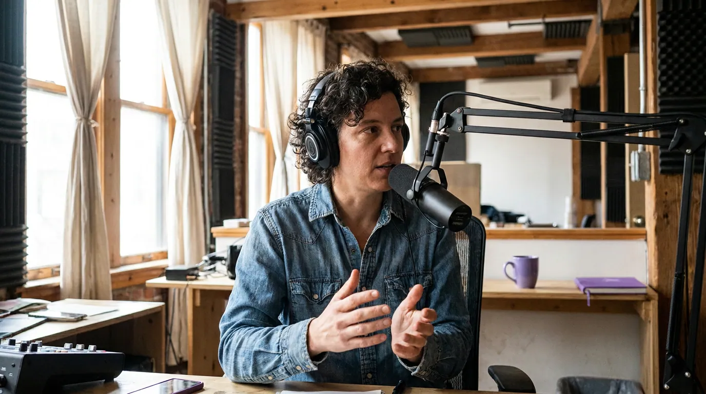
A 9:16 frame is much taller than it is wide; a normal podcast is the opposite, a wide 16:9 shot. Scaled to fit the tall frame without distorting faces, the wide video fills only a strip across the middle, leaving open bands above and below. The empty space is the gap between the source shape and the target shape.
There are two honest ways to close that gap. You can reframe, crop a tall slice out of the wide source so the speaker fills the whole 9:16 frame and there's no empty space to fill. That's the right move for a single talking head, and it's the main thing modern clipping tools automate; see how AI clip detection finds and follows the talker. Or you can keep the video small in the center and fill the bands on purpose, which is the right move when the content lives in the width, a screen share, a two-shot, a chart you can't crop.
This guide is about the second case. If your real problem is that the video should fill the frame and doesn't, the fix is the crop, not the fill, start with getting the vertical reframe right.
The five ways to fill the space, ranked
Here's the ranking up front, then the reasoning. The order is by how much each option helps a clip get watched and how intentional it looks. Reach for the top of the list; only drop down the list when the clip type forces you to.
1. Animated captions (bottom band). Captions are the highest-value thing you can put in the lower band, and not just because they fill it. Most social video is watched on mute, publishers told Digiday back in 2016 that as much as 85% of Facebook video played with the sound off, and a 2019 Verizon Media study put it at 69% in public (Forbes), both publisher-reported and directional, but the direction is settled. So for most viewers the words are the clip. Word-by-word captions sitting in the lower band give scrolling viewers something to read and a reason to stay. They earn the space twice: they fill it and they carry the content.
2. Title card or hook line (top band). A short line of text in the top band, the question the clip answers, the claim it makes, does the job of a thumbnail on a feed that has no thumbnails. Viewers make the keep-or-scroll call in the opening seconds, before the audio has said much (Castmagic), and a title card is how you spend that window. Keep it to one short line, big enough to read on a phone, and let it sit for the first two to three seconds before it fades or pins.
3. Progress bar (very bottom). A thin progress strip, a line that fills left to right as the clip plays, gives a small but real lift: it tells viewers how much is left, which nudges them past the drop-off point near the start. It's a strip, not a band, so it complements captions rather than replacing them. Low effort, low risk, mild upside. Worth turning on; not worth designing around.
4. B-roll or brand fill (either band). Relevant B-roll, a chart while the guest cites a number, footage of the thing being discussed, turns dead space into a second layer of information, and it's how the best-edited clips add movement. The catch is relevant. Generic stock loops or a logo that just sits there are filler, and viewers read filler as a reason to scroll. If the B-roll doesn't say something the audio doesn't, it's decoration, and decoration in the bands is one notch above black bars. More on earning movement honestly: your clips are boring, fixes that add movement.
5. Blurred fill (last resort). A blurred, enlarged copy of the same video behind the small centered clip is the one-click button in most apps. It fills the space and avoids hard black edges, so it's strictly better than bars. But the real content still occupies only the center strip, the whole frame looks a touch softer because the blur is built from a downscaled copy, and it reads as repurposed. Use it for a horizontal source you can't reframe and can't fill with anything better, not as a reflex because it's the easy button.
And the option to never use: plain black bars. They leave a third of the screen black, fill less of the phone than native vertical, and signal "this wasn't made for here," which tends to lower watch time and distribution. Any of the five options above beats them. If you've already shipped a clip with bars, the recovery options are in the wrong aspect ratio fix.
The three-band layout that does the work
When you do keep the video small and fill the bands, for a screen share, a two-shot, or a chart, lay the frame out in three bands and give each one a job. The top band holds the title card. The center holds the video. The bottom holds captions, with the progress bar pinned to the very edge. Stacking the high-value options this way fills both bands with things that earn their place.
Two placement rules make this hold up on a real feed. Keep your title and captions out of the platform UI safe zone, TikTok stacks its caption, buttons, and music strip across roughly the bottom-right, and Instagram crops a 9:16 Reel toward a centered window in the regular feed, so text jammed at the very edges gets covered or cut. And don't let the bands fight the center: the video stays the focal point, the bands support it. If the title is louder than the speaker, you've inverted the layout.
Which fill to use, by clip type
The right fill is decided by what's actually in the frame. A talking head should usually be reframed so there is no empty space; the fill conversation only starts when the content can't be cropped down to vertical without losing the point.
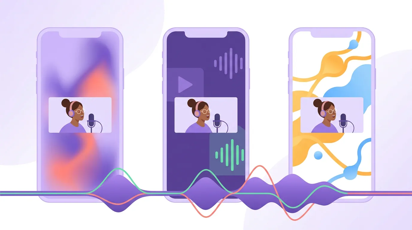
For a single talking head, reframe, crop the wide shot down so the speaker fills the 9:16 frame, captions in the lower third, no bands left over. For a screen share or chart where the information is in the width, keep it centered and fill the bands with a title card and captions; add B-roll only if it explains something. For a wide two-shot, stack the two faces vertically or track between speakers so both fill the frame, rather than shrinking the two-shot to the center and blurring the rest. Blur is what you use when none of those work and you still can't lose the clip.
Common mistakes when filling vertical empty space
- Filling the bands but leaving the video tiny. A title card on top of a postage-stamp video is still a postage-stamp video. If the content can be cropped to fill the frame, do that first, fill is for content that genuinely can't be.
- Treating blur as the default. Blur is the bottom of the ranked list for a reason: the real content still fills only the center, and the frame goes slightly soft. It beats black bars and loses to everything else. Don't make it your reflex.
- Pushing text into the platform UI. Captions or a title shoved to the very bottom-right vanish behind TikTok's buttons and music strip, and Instagram's feed crop can clip the edges. Keep the load-bearing text in the clear center band.
- Decorative B-roll. A logo or a stock loop that doesn't say anything is filler, and filler reads as skippable. B-roll has to add information the audio doesn't, or it's just a fancier black bar.
- Leaving black bars because the clip "looks fine on desktop." It won't look fine on the phone where it'll actually be watched, where it'll fill a third of the screen and read as not-made-for-here. Since clips drive an estimated 20–40% of new audience for video shows (Podcast Studio Glasgow), the bands are worth getting right.
FAQ
Should I fill the empty space in a vertical video or crop it out? Crop it out whenever you can. If the clip is a single talking head, reframe so the speaker fills the whole 9:16 frame and there's no empty space to fill, that always beats filling bands. Fill the bands only when the content lives in the width (a screen share, a chart, a wide two-shot) and a crop would lose the point.
What's the best thing to put in the top and bottom of a Reel? Captions in the bottom band and a short title or hook line up top. Captions matter most because most social video is watched on mute, as much as 85% of Facebook video, publishers told Digiday in 2016, with a 2019 Verizon Media study putting it at 69% in public (Forbes), so the words carry the clip. The title card sells the first-second stop. Add a thin progress bar at the very edge for a small extra nudge.
Are black bars on a vertical clip actually bad? Yes. Plain black bars leave a third of the screen unused, fill less of the phone than native vertical, and signal that the clip was repurposed rather than made for the feed, which tends to lower watch time and reach. Any fill option beats them. If you must keep a horizontal source small in the frame, use a blurred fill instead of hard black.
Is blurred background fill better than black bars? Slightly. Blur avoids hard edges and looks a little more finished, so it's strictly better than black bars. But the real content still fills only the center strip and the frame looks a touch softer, so it reads as repurposed. Treat it as the last resort, below captions, a title card, a progress bar, and relevant B-roll.
How do I fill the space without it looking lazy? Give the space a job. A title card that states the hook, captions that carry the audio, and a thin progress bar all do real work; a logo that just sits there or a generic stock loop does not. The test is simple: if a viewer would learn nothing from the filled band, it's decoration, and decoration reads as skippable.
Related guides: fixing a clip exported in the wrong aspect ratio, adding movement to clips that feel static, getting the vertical reframe right so faces aren't cut off, why your podcast clips get no views, and how to pick the best AI-suggested clips.