
TikTok Captions for Podcast Clips That Convert


For a podcast clip to work on TikTok, burn in bold, high-contrast captions in the visual center of the frame, one or two short lines that change in time with the speaker. Center is the only zone TikTok's own buttons never cover, and the feed is watched mostly on mute, so the captions are the clip, not a garnish. The rest is keeping them out of the dead zones and not letting them collide with TikTok's auto-captions.
That last part is the one most clippers miss. TikTok generates its own caption track, and if a viewer has it on, that white text can land on top of your burned-in line and turn both into a smear. This guide covers the TikTok-native caption look, the exact safe-zone placement on a 1080×1920 frame, how the For You crop reshapes that safe zone, and a clear rule for which caption layers to use.
What do TikTok captions need to look like?
TikTok captions should be bold, large, center-placed, and reviewed for accuracy, typically one or two lines that animate roughly in sync with speech, with a heavy stroke or background plate so they hold against any frame. The native register is high-contrast and punchy, not subtle. A 12-point grey subtitle that reads fine on a desktop monitor disappears on a phone in a feed.
The reason captions carry this much weight is the mute default. As far back as 2016, Digiday reported that "as much as 85 percent of video views happen with the sound off." Treat that as a ceiling, not a constant, the exact rate varies by platform and study, but the direction has held for a decade: a TikTok viewer reads your clip before they ever hear it. And the feed is more crowded than ever. NPR's 2026 reporting on the "clipping economy" describes a single operator running a network of 40,000 freelance clippers who are paid per view, all racing to flood TikTok, Instagram, and YouTube with snippets of long-form content (NPR, "The clipping economy," 2026). A clip whose captions are unreadable loses in the first second, no matter how good the moment is.
The TikTok-native styling choices that actually move retention:
- One emphasis word per line. Color or scale the keyword in the line (a punchline noun, a number, a name) so the eye lands on the point. This is the single most TikTok-native move and the cheapest.
- Word-by-word or phrase-by-phrase reveal. Captions that appear in step with speech keep the eye moving and the thumb still. A static paragraph reads as homework.
- Two lines maximum. A wall of text is unreadable on mute. Size each line so a viewer finishes it before it changes.
- A stroke or plate, not bare text. TikTok frames are unpredictable, a bright background eats white text. A 1–2px dark stroke or a semi-opaque plate keeps it legible everywhere.
For the typeface specifics, the caption fonts that survive a phone screen matter more than the color; a heavy sans at a large size beats any decorative font here.
Where do captions go on a TikTok frame?
Put captions in the visual center of the 1080×1920 frame, clear of the top ~108px, the bottom ~320px, the right ~120px button column, and a ~60px left edge margin. That leaves a centered safe zone of roughly 900×1492px, the only area TikTok's interface reliably leaves alone, so text there reads correctly across devices (PostPlanify, "Social Media Safe Zones 2026"). Kreatli's guide lands in the same neighborhood, describing a text-safe area of about 1080×1420px (Kreatli, "TikTok Safe Zone 2026").
Each edge is reserved for a different reason. The bottom holds the caption, handle, audio disc, and any Shop button. The right holds like, comment, share, and save, and in January 2026 TikTok added an "Add to Playlist" button at the bottom-right that grew the right dead zone by about 20px (PostPlanify). The top holds the For You / Following tabs and search. None of these appear in your video editor's preview, which is exactly why captions that look balanced on your timeline vanish on the live app.
Two TikTok-specific gotchas that the raw numbers hide. First, the bottom zone is not fixed. When a clip carries a CTA or Shop button, the bottom dead zone deepens, TikTok's own ad spec pushes the safe bottom margin to ~370px to clear it, leaving roughly a 900×1442px zone for paid placements (PostPlanify). Treat that 370px as the conservative floor and keep important caption text above it. Second, sit your block in the lower-middle of the safe zone rather than the dead center, too high and it competes with the speaker's face, too low and it risks the bottom bar. The center-vertical sweet spot is the safe zone's lower third.
How does the For You feed crop change this?
TikTok plays vertical video close to edge-to-edge in the For You feed, so a clip exported with letterbox bars or off-center framing can get its captions pushed under the UI or partially cropped. Build natively to 1080×1920 9:16 with the captions inside the center safe band, and the crop has nothing to take. The crop punishes clips that weren't framed for full-bleed vertical.
This is why a podcast clip reframed badly suffers twice: the speaker drifts toward the right third where the button column covers them, and any caption anchored to that side goes with it. Frame subjects center or center-left, never in the right third, and the For You crop becomes a non-issue. The same reframing discipline that keeps a face out of the button column keeps your captions readable, it's one decision, not two.
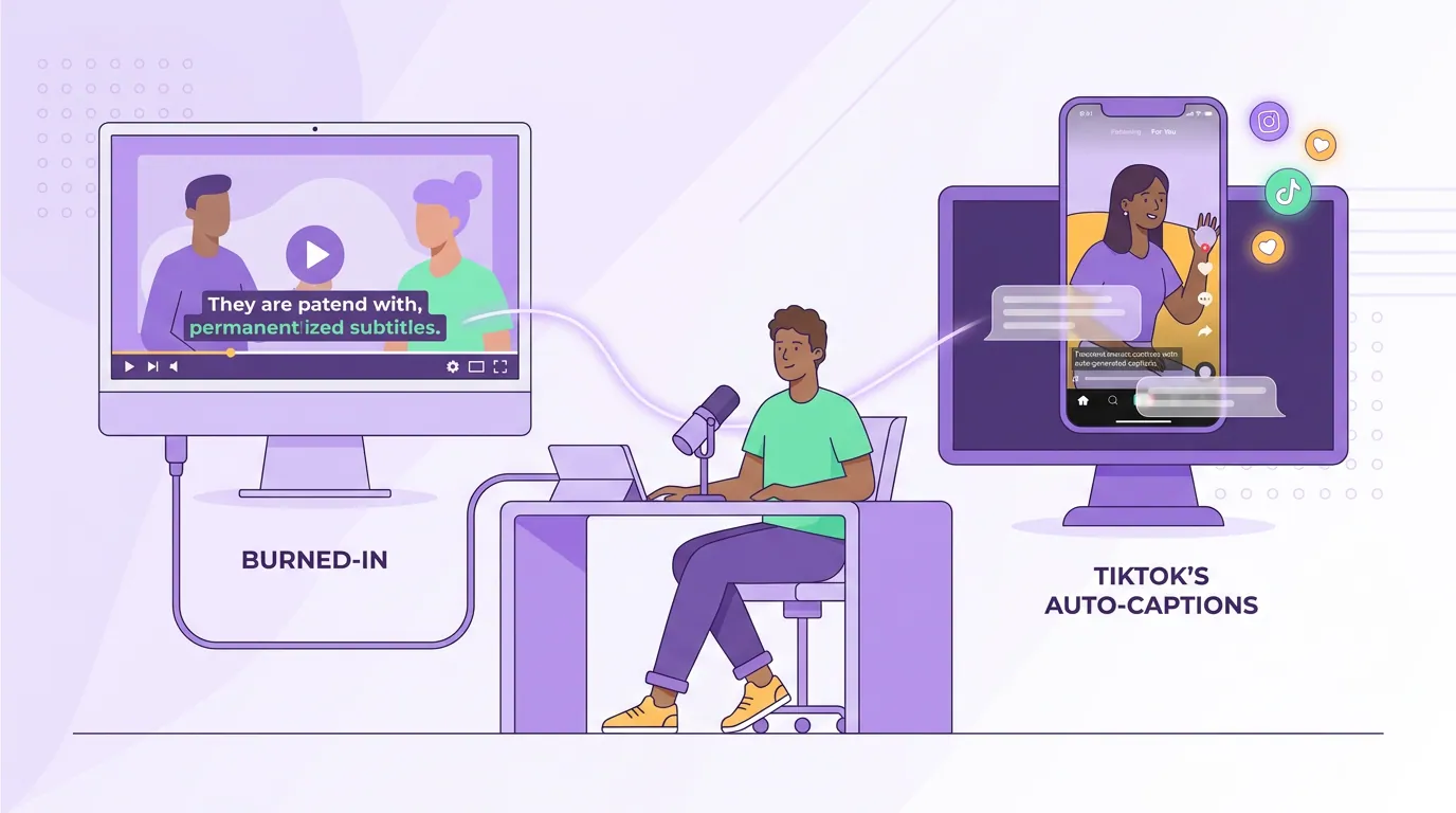
Burned-in vs TikTok's auto-captions: which do you use?
Use burned-in captions as your visible layer on TikTok, and treat TikTok's native auto-captions as optional accessibility, not your main text. Burned-in captions are baked into the pixels: full styling control, always visible, and they survive a download or re-share. TikTok's auto-captions are a separate toggleable track the app generates from speech (TikTok Newsroom, "Introducing auto captions"), useful for some viewers, but you don't control how they look or where they sit.
The collision is the part to plan around. If a viewer has TikTok's auto-captions turned on and you've also burned captions into the bottom of the frame, both render at once: "they'll overlap and look messy. Most creators who use burned-in captions turn off platform captions to avoid duplication" (Blitzcut, "Auto vs Manual vs Burned-In Captions"). But you can't force a viewer's toggle off, so the durable fix is spatial: keep your burned-in captions in the center band, well above the bottom, where TikTok's native track tends to sit. Don't fight for the same real estate.
One more reason to own the burned-in layer: accuracy. Burned-in captions are "permanently rendered directly onto the video frames during encoding," so they show the exact words you approved, whereas TikTok's auto-captions are a machine-generated speech overlay that mishears names, jargon, and homophones (Blitzcut). The catch is that once a clip is posted, the burned-in text is baked into the pixels, fixing a typo means re-exporting and re-uploading, so review the transcript before you render, not after. If you're weighing the trade-offs more broadly, the burned-in vs soft captions and auto vs manual captions breakdowns go deeper.
Common mistakes (and the fix)
- Anchoring captions to the bottom of the frame. It looks balanced in your editor and lands under TikTok's caption bar, or collides with the viewer's native track. Fix: center band, lower-middle, above the bottom ~370px.
- Right-aligned or right-third text. Reads fine on desktop, hides behind the like/comment/share column on the live app. Fix: center-align horizontally and frame the speaker center or center-left.
- Tiny, low-contrast subtitles. Desktop-legible is not phone-legible on mute. Fix: large bold type with a stroke or plate; one emphasis word per line.
- Shipping auto-captions unreviewed. TikTok's speech recognition fumbles names and jargon, and you can't easily fix it post-publish. Fix: burn in captions from a corrected transcript, the way the full captioning workflow lays out.
- Trusting the editor's clean canvas. No preview shows the live UI. Fix: preview on the actual app or with a safe-zone overlay before posting. Numbers drift with every TikTok update.
FAQ
Should I burn captions into a TikTok clip or use TikTok's auto-captions?
Burn them in. Burned-in captions give full styling control, always show on mute, and survive re-shares; TikTok's auto-captions are toggleable, unstyled, and hard to correct after posting. Use the native track only as optional accessibility, and keep it out of the same vertical zone as your burned-in line so they don't overlap.
Where is the safe zone for TikTok captions?
The centered safe zone, roughly 900×1492px on a 1080×1920 frame, clear of the top ~108px, bottom ~320px, left ~60px, and right ~120px button column (PostPlanify; Kreatli). Sit your caption block in the lower-middle of that zone, and if the clip carries a CTA or Shop button keep text above ~370px from the bottom to clear the deeper ad margin.
What font and size work best for TikTok captions?
A heavy sans-serif at a large size with a dark stroke or plate, sized to read at arm's length on a phone. Keep to one or two lines, color or scale one emphasis word per line, and animate the reveal roughly in time with speech. Style matters less than weight and contrast, see the caption font breakdown.
Why do my TikTok captions get cut off even when they look fine in my editor?
Because the editor's canvas is clean and the live app stacks buttons over it, and the For You feed plays full-bleed. Captions in the right third hide behind the button column; captions at the bottom slide under the caption bar or the viewer's native track. Build inside the center safe band and the crop has nothing to take.
Do TikTok captions help the clip get discovered?
Indirectly. TikTok mostly doesn't index burned-in caption text the way YouTube does, so captions win you retention, not search, and on a mute-first feed, retention is most of the battle. Clips reliably drive a meaningful share of a show's new audience (Podcast Studio Glasgow). Picking the right moment matters as much as the caption, see how to pick the best AI-suggested clips and how clip detection works.