
Podcast Background Setup That Doesn't Distract

Move your chair three to six feet off the wall, point a soft light at the background, and put at most two or three deliberate objects behind you on their own depth plane. That separation is what makes a background read as a set instead of a bedroom, the depth blurs the wall and the objects, so they support your face instead of competing with it. Everything else is editing down to what earns its spot.
Most first-time backdrops fail for one reason: the host sits flush against a flat wall, so the camera renders a sharp, evenly-lit slab of drywall directly behind their head. The fix is almost never a green screen or a fabric backdrop you buy. It's distance and one light. This matters more than it used to because video is now the front door to most shows, 53% of new US weekly listeners prefer to watch a podcast, up from 30% in April 2022 (Backlinko, podcast stats), and YouTube alone now has more than a billion monthly podcast viewers worldwide (Variety, February 2025). The wall behind you is on screen as much as your face.
How far should you sit from the wall for a podcast background?
Sit at least three feet off the back wall, and six feet if the room allows it. Distance is the variable that changes a podcast background most. It creates depth between you and the wall, lets your front light fall off before it hits the background, and, on a camera or phone with any aperture control, throws the wall slightly out of focus so its texture and any clutter soften instead of fighting your face.
Flush against the wall, three problems stack up at once. Your shadow lands hard on the drywall right behind your head. The wall is in the same focal plane as your face, so every scuff and outlet reads sharp. And the background gets the same light you do, which flattens the whole image into one bright plane. Step a few feet forward and all three ease off together.
If your room won't give you six feet, three is enough to make a visible difference. The point isn't a number you hit perfectly, it's to stop sitting on the wall. Pair the distance with a light aimed at the background and you've solved most of the problem before you've bought anything. The lighting side is its own decision; we walk through it in three-point lighting for a video podcast.
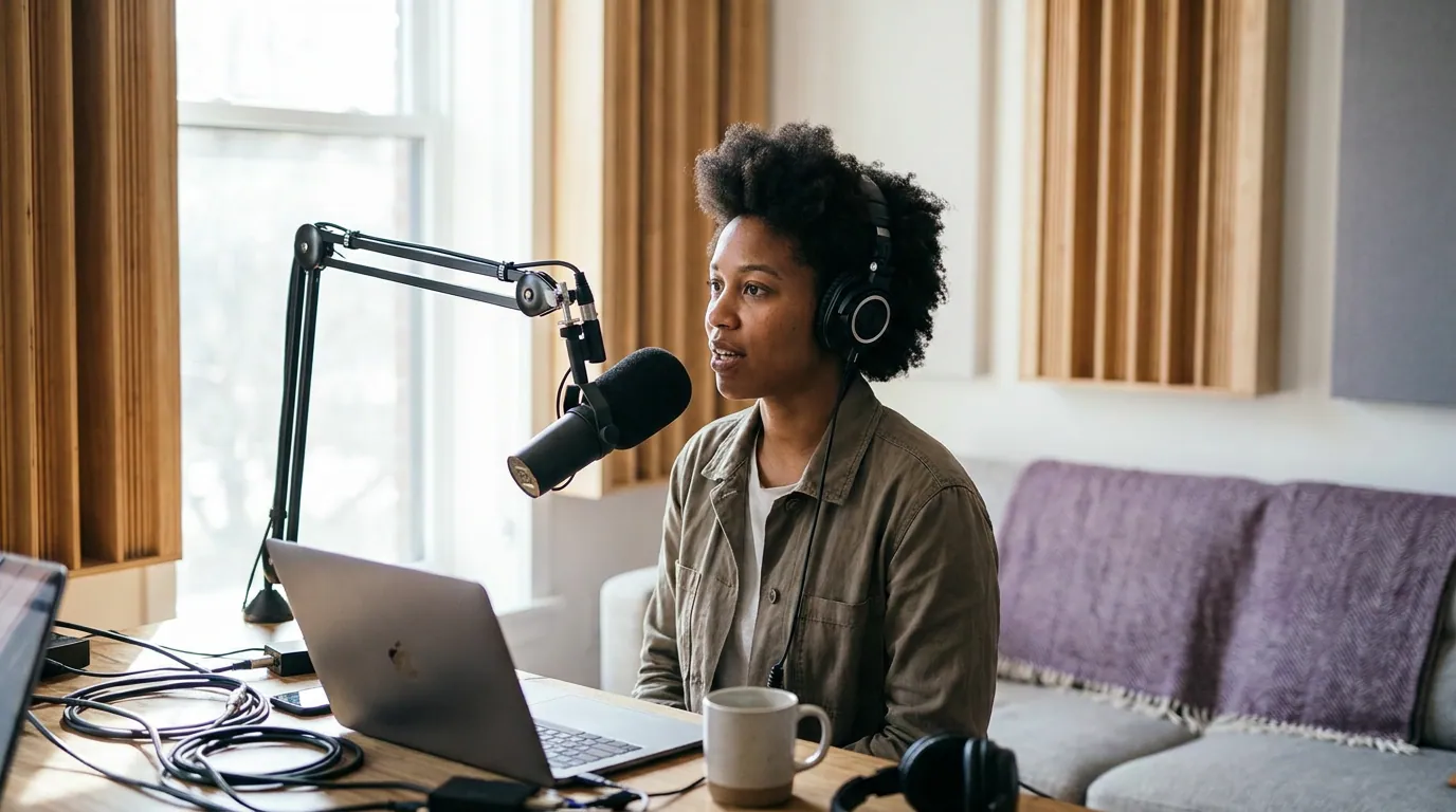
What makes a background look like a "set" instead of a bedroom?
A set reads as deliberate; a bedroom reads as accidental. Three things separate them on camera: depth between you and the wall, a small number of objects placed for the frame rather than for the room, and the absence of anything that says "I sleep here", a bed corner, a closet door, a pile of laundry, a tangle of cables. Deliberate beats decorated.
The bedroom read almost always comes from one of a handful of tells, and they're worth naming because they're easy to miss when you're looking at your own room instead of your own frame:
- A flat wall flush behind your head, no depth, so it looks like a passport photo.
- A literal bed, headboard, or pillows in the corner of frame.
- A closet, a door, or a window blind that pulls the eye to a hard vertical line beside your head.
- Cables, a power strip, or a charging mess snaking across the bottom of the shot.
- Too many small objects, a wall of framed photos, a crowded shelf, a poster grid, that each ask for a second of attention.
None of these need money to fix. They need you to look at the frame, not the room. The fastest move is to recompose: turn your chair, change the angle so the bed or window falls outside the shot, and gain depth in the process. We cover how the angle and crop interact in framing a talking-head podcast, because backdrop and framing are the same decision made twice.
The three-layer backdrop recipe
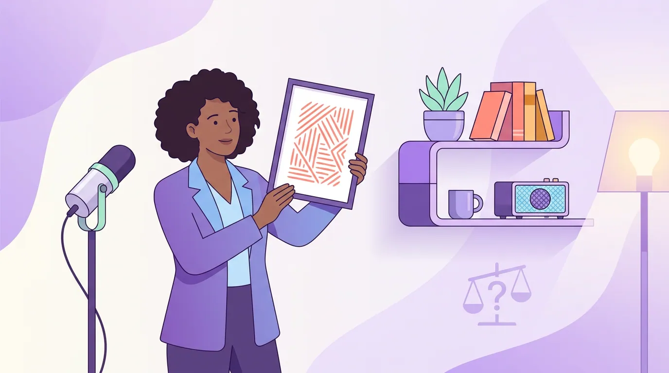
Build the background in three depth planes, not as a flat wall to decorate. The back layer is the wall itself, lit softly so it isn't a dead slab. The mid layer is one piece of furniture, a shelf, a console, a credenza, holding at most two or three objects. The foreground is you, several feet in front, sharp and well-lit. Three planes is what your eye reads as a room with depth instead of a backdrop pinned behind your head.
For the mid layer, the dependable trio is one plant, one warm light source, and one personal object that says something true about the show. A trailing plant adds an organic, irregular shape that breaks up straight architectural lines. A small lamp or a string light low on the shelf adds a warm glow and a point of interest that isn't your face. The personal object, a relevant book, an instrument, a piece of gear, a single framed thing, gives a returning viewer one detail to register without studying the frame.
That's the ceiling, not a shopping list. Two of the three is often better than all three. The mistake is treating the shelf as storage you happen to be filming; treat it as a composition with two or three intentional points, spaced apart so each sits clearly on its own.
The "does it earn its spot?" test
Every object behind you has to pass one test, applied to each item one at a time: does it add depth, say something true about you or the show, or pull focus from your face? The first two earn its place. The third gets it removed. If an object does none of the three, it's just there, it's clutter, and clutter is the default state of any room you didn't compose on purpose.
Run it as a literal pass. Look at your frame, name each object you can see behind you, and ask the three questions out loud. The water bottle? Cut it. The stack of mail? Cut it. The seven framed photos? Keep one, cut six. The plant that softens the corner? Keep it. Within a few minutes you've gone from a decorated room to a composed set, and you spent nothing. This editing-down instinct is the same one that makes the rest of your video setup work; it shows up again in filming a video podcast for the first time.
Common backdrop mistakes (and the fix)
Most failed podcast backgrounds are one of these five, and each has a specific fix.
- Sitting flush against the wall. The root cause of nearly every bad background. Fix: move three to six feet forward before you touch anything else.
- No light on the background. A dark, evenly-grey wall reads as a void. Fix: aim one soft light or a cheap string light at the wall so it has its own glow and separates from you.
- A backlight blowing out the window. Filming with a bright window behind you turns you into a silhouette. Fix: face the window or curtain it; never let it be your sole back source.
- The "props from a kit" look. A backdrop that screams influencer-starter-pack feels staged. Fix: use objects you actually own and that relate to the show, not a generic neon sign.
- Clutter you stopped seeing. Cables, mugs, and laundry vanish to you and pop on camera. Fix: shoot a 10-second test clip, watch it on your phone, and remove everything that fails the earns-its-spot test.
A separate trap is moving the camera around to chase a better background and losing your eye line in the process, backdrop and framing have to be solved together, and the angle that hides your bed might also wreck your composition. When you're deciding whether one camera or two changes the calculus, single vs multi-camera podcast setups covers how angle choices interact with what's behind you.
What do you actually need to buy?
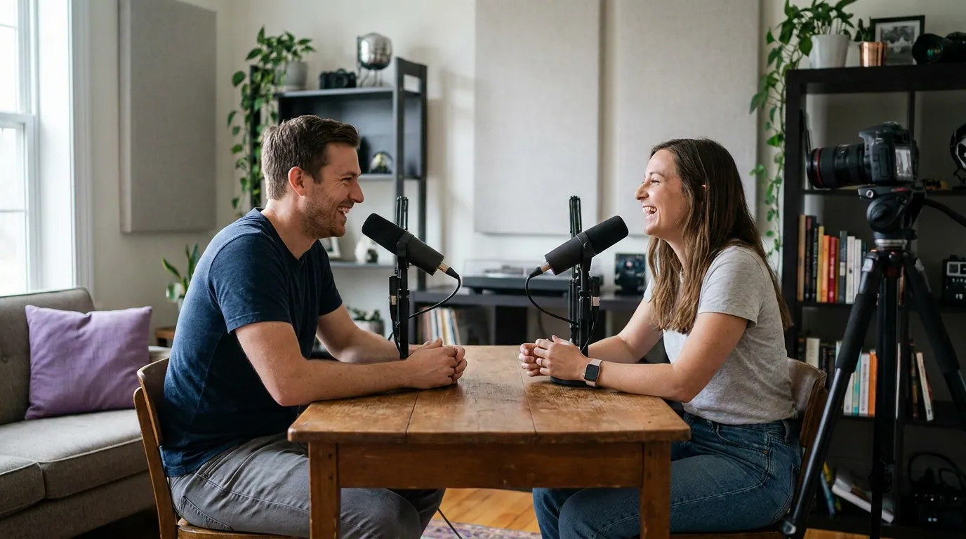
Close to nothing. A good podcast background is distance plus one light plus editing-down, and all three are free or nearly so. If you spend anything, spend it on one soft light aimed at the background and maybe a plant, together under $50, and they do more than any backdrop product. Skip the green screen unless you have a specific reason; for a talking-head show it usually adds a hard edge around your hair and a "virtual set" cheapness that a real corner of a real room avoids. Money is far better spent on your audio chain than your backdrop, see the best podcast mic under $100 and podcast mics by budget tier, because listeners forgive a plain background long before they forgive bad sound.
Frequently asked questions
How far should I sit from the wall behind me? At least three feet, ideally six if the room allows. That gap creates depth, lets your front light fall off before it reaches the wall, and softens the background so it supports your face instead of competing with it. If you can only get three feet, that still beats sitting flush against the drywall.
What should I put behind me on a podcast? At most two or three deliberate objects on a mid-layer surface: one plant for organic shape, one warm light for glow and interest, and one personal object that relates to the show. Run each through one test, does it add depth, say something true, or just pull focus? Keep the first two; cut the rest.
Do I need a green screen for a video podcast? Usually not. For a single seated host, a real corner of a real room with three feet of depth and one background light looks more natural than a green screen, which often leaves a hard edge around your hair. Use a green screen only when you specifically need to replace the background, not as a default.
Why does my background look flat and amateurish? Almost always because you're sitting too close to the wall with no light on it, so you and the background share one flat plane. Move forward, add a soft light aimed at the wall, and give the camera some depth to read. That one change fixes the flat look more reliably than any prop.
How do I check if my background is too distracting? Record a 10-second test, watch it back on your phone, and name every object you can see behind you. Anything you notice before you notice your face is too distracting, remove it. Watching clips on a small vertical screen exaggerates clutter, which is exactly why it's the honest test.