
Accessible Captions: Beyond Just Adding Text

Accessible captions are not just a transcript burned onto the screen. To be usable by d/Deaf and hard-of-hearing viewers, they need four things plain captions skip: a label for who is speaking, bracketed cues for non-speech sounds, enough contrast to read against any frame, and a reading speed slow enough to finish. Those four layers turn a subtitle into access.
Almost every auto-caption tool gets you the words. That is the easy 80%. The 20% that decides whether a d/Deaf viewer can follow your show, speaker changes, a laugh, an off-screen alarm, a song under the dialogue, two lines flashing past in half a second, is the part most creators never touch. This guide is that part: the conventions broadcasters and streamers already use, why each one matters, and how to apply them to short vertical clips without turning captioning into a research project.
Why "captions on" isn't the same as "accessible"
The case for captions at all is usually framed around silent autoplay, a widely repeated estimate puts around 85% of social video viewed with the sound off (Digiday, 2016 publisher-reported data; treat it as directional, since individual studies range from roughly 69% to 85% and the figure is a decade old). That's the mute-scroller argument, and it's real. But it quietly treats captions as a convenience for hearing viewers who happen to have the sound down.
For d/Deaf and HoH viewers, captions aren't a convenience. They are the whole programme. And a caption that only carries the words, no speaker labels, no [laughter], low-contrast text smearing into a bright background, leaves those viewers guessing at exactly the things hearing viewers get for free. The difference between "subtitles" and "captions" is precisely this: subtitles assume you can hear and just need the words; captions assume you cannot hear and need the full audio picture. Most podcast clips ship subtitles and call them captions.
It also happens to be good distribution. Clips are the front door to a lot of shows, one studio's client data puts clips at 20–40% of new audience, with 2–5× reach lifts for video podcasts (Podcast Studio Glasgow), that's one source's directional range, not a platform-wide audit. A wider front door includes the millions of people who rely on captions to follow any video at all.
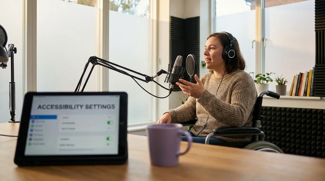
The four layers of an accessible caption
Start from a clean transcript, that's the base. Accessibility is four layers stacked on top. Get the words right first (the full transcribe-style-sync-burn-export workflow is here), then add these.
Layer 1, Speaker labels: who is talking
When two or more people talk, a caption that just runs the words together forces a Deaf viewer to guess who said what. On a podcast clip, almost always a conversation, this is the single most common accessibility failure. The fix follows the broadcast convention from the DCMP Captioning Key: identify the speaker by placement under them when you can, and when you can't, label by name.
Practical rules for a vertical clip:
- Two visible speakers, clear cuts. If the camera cuts to whoever's talking, you often don't need a name label, placement does the work. Keep the caption under the active speaker.
- Off-screen or overlapping voices. Label them. The DCMP convention puts a known name in parentheses on its own line,
(Sarah), and an unknown speaker by description:(male narrator),(guest #2). - Single host. No label needed. Don't clutter a solo clip with a name on every line.
A lightweight version that reads well on short clips: a small persistent name tag that changes color or position per speaker. The point isn't the exact format, it's that the viewer never has to wonder whose words they're reading.
Layer 2, Non-speech cues: the sounds that carry meaning
Hearing viewers get a laugh, a doorbell, a dramatic music swell, a sarcastic tone, for free. Captions have to put those in text or the moment lands flat, or doesn't land at all. The DCMP standard is brackets around the sound, naming the source, placed as close as possible to where it happens: [laughter], [phone buzzes], [tense music].
The judgment call is which sounds to include. Caption a sound when it's essential to understanding the moment, not every ambient noise. Use these three tests:
- Does it change the meaning? A
[sarcastic]tag or[laughter]after a line tells a Deaf viewer the comment was a joke, not a statement. That's essential. - Is the source off-screen? An off-screen
[doorbell]that the hosts react to needs a cue; on-screen, visible sounds usually don't. - Is it plot- or punchline-critical? Music under a reveal, a sudden silence, an alarm, caption it. Background hum during a normal chat, skip it.
For music with lyrics that matter, caption the lyrics and frame them with the song; for instrumental music under speech, a short [upbeat music] is enough. Don't editorialize, [gentle music], not [beautiful music].
Layer 3, Contrast: text that survives any frame
This is where the most "captions" technically fail accessibility. The WCAG 1.4.3 Contrast (Minimum) standard, Level AA, requires a contrast ratio of at least 4.5:1 between text and background for normal text, and 3:1 for large text (roughly 18pt+, or 14pt+ bold). Caption text is usually large and bold, so 3:1 is your floor, but aim for 4.5:1, because the background behind a caption changes every frame as the video plays.
That last point is the trap. You can't pick one background to test against. A bright window, a white shirt, a sky, any frame can wipe out white-on-nothing text. Three reliable ways to hold contrast across every frame:
- A solid or semi-transparent background bar behind the text. The most bulletproof option; the text sits on a controlled color regardless of the footage.
- A heavy outline or drop shadow on each letter. Works well on busy footage, keeps the look clean, no bar.
- High-contrast color pairing, and verify it. White text with a black outline clears 4.5:1 against almost anything. Yellow-on-white or light-gray-on-light-background does not. Check pairs in a free tool like the WebAIM Contrast Checker before you commit a brand style.
Low contrast is the most common accessibility error on the web, it appears on 83.9% of home pages in the February 2026 WebAIM Million audit (WebAIM). Captions inherit the same problem the moment a creator picks an on-brand pastel over a readable one. Font choice compounds it; a thin, condensed typeface can fail contrast even at the right color, which is why caption fonts built for small vertical screens matter as much as the color.
Layer 4, Reading speed: slow enough to finish
A caption nobody can finish reading is worse than no caption, it implies access while denying it. Broadcast and streaming standards cap reading speed, and the unit is characters per second (CPS) or words per minute (WPM). The BBC Subtitle Guidelines target 160–180 WPM for general audiences, which works out to roughly 15 CPS at an average ~5 characters per word including spaces (BBC states the WPM target; the CPS figure is the conversion). Netflix sets the limit in CPS directly: 20 CPS for adult content and 17 CPS for children's (Netflix English Timed Text Style Guide).
On a fast-talking podcast, you'll routinely blow past these. Two fixes, in order of preference:
- Lightly edit for reading speed, not for prettiness. Drop redundant filler ("you know," "I mean," repeated false starts) so the line fits the time. Keep meaning and tone intact, don't sanitize the voice into corporate prose.
- Hold the caption a beat longer where the edit allows, or split a dense line across two displays. Word-by-word "karaoke" animation can help or hurt here: it paces reading on slow segments but can flash too fast on rapid speech.
The mute test catches speed problems instantly: if you can't comfortably read a line before it vanishes, your viewer can't either.
The accessible-caption checklist
Run this on every clip before it ships. It's the four layers turned into a pass/fail list, the part most caption tutorials never get to.
| Check | The rule | Source |
|---|---|---|
| Speaker labels | Every speaker change is clear by placement or a name in parentheses | DCMP Captioning Key |
| Non-speech cues | Meaning-carrying sounds in brackets: [laughter], [alarm], [tense music] | DCMP Captioning Key |
| Contrast | Text-to-background ≥ 4.5:1 across every frame (bar, outline, or verified color) | WCAG 1.4.3 (AA) |
| Reading speed | Under ~15 CPS / ~160–180 WPM; no line flashes faster than you can read | BBC; Netflix |
| Placement | Captions in the middle third, clear of platform UI and the progress bar | Platform UI norm |
| Accuracy | Names, numbers, jargon, crosstalk verified, the load-bearing 5% | Caption-review practice |
The first four are the accessibility layers. The last two are table stakes that quietly break access too: a caption hidden behind the Reels progress bar is as inaccessible as a missing one, and a misspelled guest name is misinformation for someone who can't hear the correction.
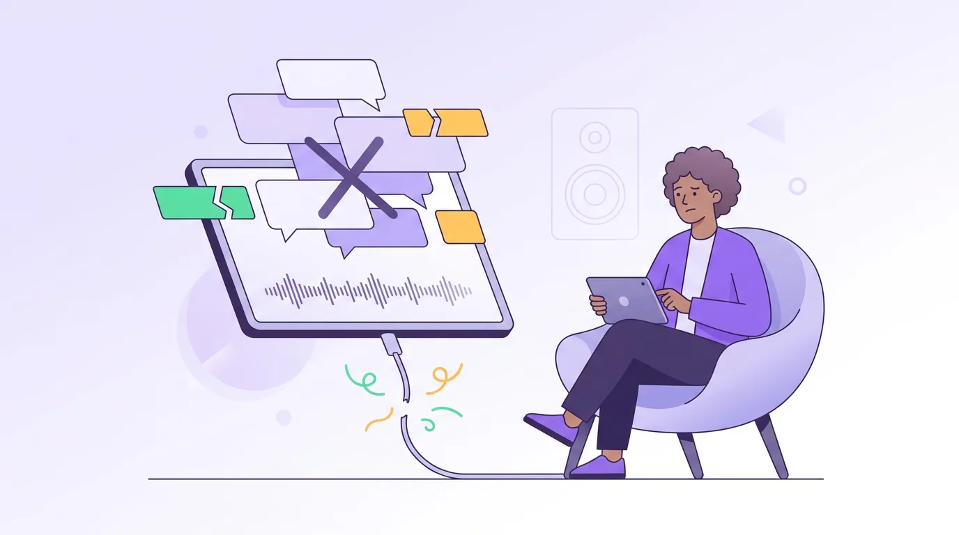
Common mistakes that break accessibility
Treating subtitles as captions. Running only the spoken words and skipping speaker labels and sound cues is the default of nearly every auto tool. It's fine for a hearing viewer with the sound down; it fails the viewer who can't hear at all.
On-brand colors that fail contrast. A pastel violet caption on a bright clip looks consistent and reads as nothing against a sky. Verify your brand caption style against WCAG 4.5:1 before you lock it in. Brand consistency that nobody can read isn't a brand asset.
Captioning every ambient sound. Over-cueing is its own failure, [wind], [chair creaks], [paper rustles] on a normal chat buries the dialogue. Caption sounds that change meaning, not sounds that merely exist.
Letting fast speech blow past reading speed. Verbatim captions on a rapid-fire host routinely run 25–30 CPS, well past the BBC's ~15 ceiling. Edit filler lightly to fit the time; don't rewrite the personality out.
Hiding captions behind platform UI. The bottom third of Shorts, Reels, and TikTok is covered by buttons and the progress bar. Put captions in the middle third so no word is clipped, an accessibility issue, not just an aesthetic one.
Trusting auto-accuracy on the words that matter. AI captions land ~90–95% on clean audio, but the wrong 5% clusters on names, numbers, and crosstalk. For a Deaf viewer there's no audio to fall back on, so review those categories every time, a reusable custom dictionary handles recurring names across a season.
Tools: what handles the four layers honestly
No tool does all four layers perfectly on its own, and you should be skeptical of any that claims to. Here's the honest split.
| Layer | What tools automate well | What still needs you |
|---|---|---|
| Speaker labels | Speaker diarization (detecting "a new voice") | Naming voices, fixing mislabeled crosstalk |
| Non-speech cues | Some auto-detect [music] / [applause] | The judgment of which sounds matter |
| Contrast | Style presets, background bars, outlines | Verifying the ratio against your footage |
| Reading speed | CPS/WPM warnings, auto line-splitting | The editorial trim to fit the time |
Auto captioners, including QuickReel's, get you accurate words, a stylable preset (so contrast and placement are set once for the whole show), and word-level timing fast. They're an accelerant for the base layer and the styling. The accessibility judgment, which sounds to cue, how to label overlapping voices, whether a line is genuinely readable, is still a human pass. That's the same honest framing as auto vs manual captioning generally: AI does the volume, you do the 20% that carries the meaning. For accessibility, that 20% is the whole point.
One more decision sits underneath all of this: burned-in versus soft captions. Burned-in (hardcoded) captions are the standard for native social clips and guarantee everyone sees them, but they can't be turned off or restyled by the viewer, and they don't feed screen readers. Soft captions are more flexible and better for long-form accessibility compliance. The full burned-in vs soft tradeoff is here; for short vertical clips, burned-in with the four layers baked in is the practical answer.
FAQ
What's the difference between subtitles and captions? Subtitles assume you can hear and only need the words, usually for translation or sound-off convenience. Captions assume you cannot hear and carry the full audio picture: speaker labels, sound effects in brackets, music cues, and tone. Most podcast clips ship subtitles and mislabel them as captions.
How do I caption non-speech sounds? Put the sound in brackets, naming the source, as close as possible to where it happens, [laughter], [phone rings], [ominous music], following the DCMP Captioning Key. Only caption sounds that change meaning or are essential to the moment; skip routine ambient noise so the dialogue stays readable.
What contrast ratio do captions need? At least 4.5:1 between text and background for normal text under WCAG 1.4.3 Level AA, or 3:1 for large text (roughly 18pt+). Because the background changes every frame, use a background bar or heavy outline and verify the color pair in a tool like WebAIM's Contrast Checker rather than guessing.
How fast can captions go before people can't read them? The BBC targets 160–180 words per minute (about 15 characters per second once converted); Netflix caps adult content at 20 CPS and children's at 17. On fast podcasts, lightly trim filler to fit the time rather than letting lines flash past. If you can't comfortably read a line on muted playback, neither can your viewer.
Do I need to label every speaker on a podcast clip? Only when it isn't obvious who's talking. If the camera cuts to the active speaker, placement does the work and a name label just clutters the frame. Label off-screen voices, overlapping crosstalk, and any moment where a Deaf viewer would otherwise have to guess who said what.
Are auto-generated captions accessible by default? No. They get you accurate words (~90–95% on clean audio), which is the base layer, but they skip speaker labels, sound cues, contrast verification, and reading-speed editing. Auto-caption first, then run the accessible-caption checklist, that human pass is what makes them usable for d/Deaf and HoH viewers.