
Captions for YouTube Shorts From Podcasts


For podcast clips on YouTube Shorts, burn your own captions into the video, place them in the middle band, and keep them clear of the right-side button column and the bottom title bar. Let YouTube's auto CC track ride along as a backup, but don't rely on it, it lands at the top and you can't restyle it. Burned-in captions do the work.
That's the short version. The longer version matters because YouTube Shorts hides text in two places most editors never check, and because captions earn their keep differently here than on your main channel. This is the part the generic "add captions to YouTube" tutorials skip.
Why captions are non-negotiable on Shorts
Most Shorts get watched on mute or with the volume low, in a feed, with the viewer's thumb already hovering to scroll. A widely cited estimate puts roughly 85% of social video viewed with the sound off (Digiday, 2016 publisher-reported data), treat it as directional, not precise, since it's a decade old and individual studies range from about 69% to 85%. The exact number drifts. The behavior doesn't. If your clip can't be understood silently, it doesn't exist for most of the feed.
For podcast clips that matters double, because the clip is usually the front door to the whole show. YouTube now has more than 1 billion monthly podcast viewers (Variety, Feb 2025), and a large share of new listeners now find shows by watching short clips first. One studio's client data attributes 20–40% of new audience and reach lifts of 2–5× to clips for video shows (Podcast Studio Glasgow), one source's directional range, not a platform audit, but the direction is consistent with everything else. A muted clip with no readable captions wastes that front door.
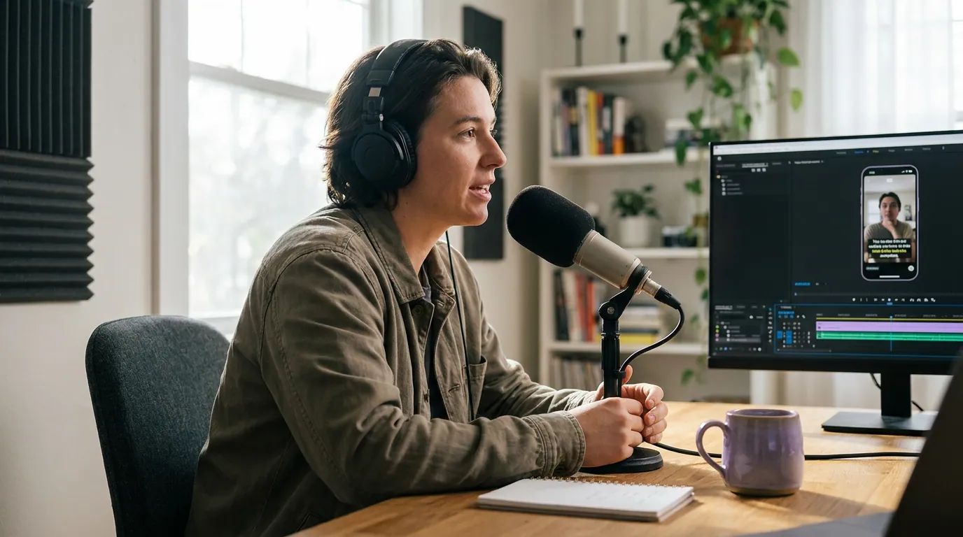
The Shorts safe zone: where captions go to hide
Here is the part that separates a clip that reads from one that doesn't. The Shorts player is a 1080×1920 canvas, but the YouTube interface covers three regions of it, and unlike TikTok or Reels, the coverage is asymmetric. Caption into the wrong spot and the player's own buttons sit on top of your words.
Three rules fall straight out of that map:
- Stay out of the bottom. The bottom ~300–450 pixels hold the title, channel name, and music attribution bar, and that band grows when a viewer taps to expand the description, so design for the expanded state. The "captions sit at the bottom" habit from TV subtitles will bury your text under YouTube's own chrome on a phone. Caption in the middle third instead.
- Mind the right edge. The action buttons (subscribe, like, comment, share) run 120–190 pixels into the frame on the right. A line you centered on your monitor can sit half-hidden behind the like button on a phone. Nudge your caption block's optical center roughly 40 pixels left of true center to compensate.
- Keep the top clear too. The top ~180 pixels carry the player's nav. It's where YouTube's own auto-caption track lands, so it's the last place you want your hook text.
Exact pixels vary by device, phones with a notch or a Dynamic Island shift things, so the only reliable check is the next section's muted phone test. But the asymmetry is the takeaway: Shorts is not symmetric like Reels, and centering by eye is how good captions end up under a button.
Burned-in captions vs YouTube's CC track on Shorts
YouTube auto-generates a closed-caption track for Shorts using speech recognition (YouTube Help), and viewers toggle it from the player's menu. So why burn your own in at all? Because the auto track is built for accessibility, not for the silent scroll, and in practice, on Shorts it's unusually rigid.
The viewer-facing auto CC track on a Short can't be restyled, resized, or recolored the way you can style burned-in text, it tends to sit near the top of the frame rather than in your safe band, and it inherits speech-recognition errors on names, brands, and crosstalk, the exact words your podcast leans on. It's also off by default for many viewers and takes anywhere from a few hours to a few days to generate after you publish. None of that is fatal; it just means the auto track can't carry the read by itself.
The rule I use is simple. Burn your own captions into every Short so the read works the instant the clip loads, on mute, in the safe band, in your show's style. Then leave YouTube's auto track on too, it costs nothing, gives deaf and hard-of-hearing viewers a proper toggleable option, and feeds the words to YouTube's systems. You're not choosing one. You're stacking a controlled visual layer over an automated accessibility layer. The full tradeoff between the two approaches is in burned-in vs soft captions for podcast clips; for Shorts specifically, burned-in is the default and the CC track is the safety net.
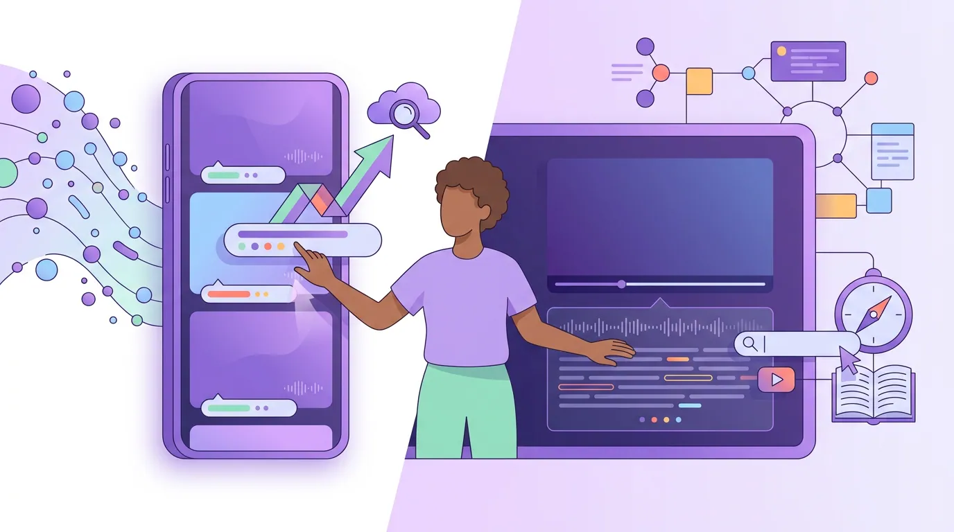
How captions move discovery on Shorts vs long-form
Captions help both surfaces, but the mechanism is different, and confusing the two is why some creators caption for the wrong goal. On a Short, captions are a retention lever: they keep a muted, scrolling viewer reading past the first second, which lifts the watch-completion signal Shorts ranks on. On a long-form episode, the caption file is also a search and indexing lever: YouTube reads the transcript, so accurate captions help the full video surface in search and suggestions.
In practice: for Shorts, optimize the visible read, big, legible, in the safe band, accurate on the first two seconds. For the full episode, also upload a clean caption file (SRT) in YouTube Studio so the transcript is correct for search; the auto track alone leaves errors on your guest names and key terms. If you're planning the Shorts side of this more broadly, the feed mechanics, why the Shorts shelf behaves separately from your channel and when a Short should link back to the episode, are covered in turning podcast episodes into YouTube Shorts.
Common mistakes (and the fix)
- Captioning at the very bottom. It works on a desktop preview and disappears under the title and music bar on a phone. Move captions to the middle third.
- Centering by eye. The right-side button column makes Shorts asymmetric; centered text drifts under the like button. Shift the optical center ~40 px left.
- Relying on YouTube's auto track for the read. It's off by default, lands at the top, lags after publishing, and can't be restyled. Burn your own in; keep the auto track as a backup.
- Lines too long or too fast. One to two lines on screen, never a paragraph. If a viewer can't finish reading before the line changes, cut the line.
- Never checking on mute. You know what you said, so your brain repairs errors on screen. Watch it silently on a phone to catch the wrong name and the cut-off word. The whole captioning pipeline, end to end, is in how to add captions to podcast clips.
FAQ
Does YouTube add captions to Shorts automatically? Yes. YouTube auto-generates a closed-caption track for Shorts via speech recognition (YouTube Help). But in practice it's off by default for many viewers, tends to sit at the top of the frame, can't be restyled the way burned-in text can, and takes hours to days to appear, so burn your own captions in for the read.
Where should captions go on a YouTube Short? In the middle third of the frame. Across published Shorts safe-zone guides, the bottom title and music bar covers roughly the lower 300–450 pixels and the right-side action buttons cover ~120–190 pixels (see the Kreatli safe-zone guide, 2026), so caption above the bottom band and shift the block slightly left of true center to clear the buttons. Verify on an actual phone.
Burned-in or soft captions for Shorts? Burned-in for the visible read, because you control the look and they show on mute without a toggle. Keep YouTube's soft auto track on as well for accessibility. The detailed tradeoff is in burned-in vs soft captions.
Should I correct YouTube's auto-captions on Shorts? For the Short itself, your burned-in captions carry the read, so the auto track matters less. For the full long-form episode, yes, upload a clean SRT in YouTube Studio so the transcript is accurate for search. Whether to fix every word by hand depends on volume; see auto vs manual captions.
What font and size work for Shorts captions? A heavy sans-serif, large enough to read at arm's length on a phone, with a contrasting outline or background so it survives any footage. Avoid thin or decorative faces, they read as amateur at small sizes. See best caption fonts for podcast clips.