
Podcast Cover Art: Specs, Sizes, and Design Rules


Design your podcast cover at 3000 x 3000 pixels, square (1:1), in RGB color, exported as JPEG or PNG, and kept under 512KB. That single file passes Apple Podcasts, Spotify, and YouTube at once, so you only have to make one. Apple rejects anything below 1400 x 1400; Spotify accepts down to 640 x 640 but you should never design that small.
Hit those numbers and your file gets accepted. Whether anyone can read it is a separate problem, and it's the one most new shows get wrong. Your cover almost never appears at 3000 pixels. It shows up as a 55-pixel row in someone's library, an 80-pixel notification badge, a circle next to a YouTube comment. If your title turns to mush at that size, the spec sheet didn't save you.
Below is the verified spec table, the file-size trick that trips up almost everyone, an original test for thumbnail legibility you can run in ten seconds, and a do/don't checklist for text, contrast, and margins.
What are the podcast cover art requirements?
Every podcast directory pulls its cover art from your RSS feed and applies near-identical rules, all descended from Apple's. Design at 3000 x 3000 px, 1:1 square, RGB color space, saved as JPEG or PNG, under 512KB. Apple's hard floor is 1400 x 1400; Spotify's is 640 x 640. Apple also requires a flat image with no transparency or alpha channel.
The reason one file works everywhere is that Apple Podcasts set the de facto standard and the rest follow it (Apple Podcasts show cover template; Spotify cover art requirements). Build to Apple's maximum and you're inside everyone's bounds.
The full spec, per platform
The differences are small and almost always about the minimum, never the recommended size. Build at 3000 and the minimums never apply to you.
| Spec | Apple Podcasts | Spotify |
|---|---|---|
| Recommended size | 3000 x 3000 px | 3000 x 3000 px |
| Minimum size | 1400 x 1400 px | 640 x 640 px |
| Aspect ratio | 1:1 square | 1:1 square |
| Format | JPEG or PNG (no transparency) | JPEG or PNG |
| Color space | RGB | sRGB (no embedded profiles) |
Sources: Apple Podcasts show cover template, Spotify cover art requirements, cross-checked against Transistor's host-side spec sheet, which also lists the practical 512KB / 72 dpi figures hosts enforce. One caveat worth stating plainly: the 512KB limit and exact minimums get worded slightly differently across directories and over time, so confirm against the official Apple and Spotify pages before you publish, they are the only sources that update in real time.
The 512KB problem, and how to fix it
The file-size ceiling is the one spec people fail by accident. A clean 3000 x 3000 PNG can easily land at 2-4MB, far over 512KB, and your host will reject it. Three fixes, in order:
- Export as JPEG at 80-90% quality. This alone usually gets a photographic cover comfortably under 512KB with no visible loss. Reserve PNG for flat, hard-edged designs (bold shapes, solid color) where it actually compresses smaller and stays crisp.
- Strip the metadata and color profile. Embedded ICC profiles and camera metadata add weight and can shift your colors on Spotify, which ignores embedded profiles. Export in plain sRGB.
- If it's still too big, drop the pixel dimensions, 3000 to 2000, or 1500 if you must. You lose nothing the eye can see at display sizes, and you stay above every minimum.
Do not solve this by upscaling a small file to fake the resolution. Spotify's own guidance tells you not to upscale, and it shows: an upscaled 800-pixel image stretched to 3000 looks soft on a TV or car dashboard, exactly where high resolution earns its keep (Spotify cover art requirements). Start big, scale down.
The small-thumbnail legibility test
Here is the rule almost no spec guide gives you. Your cover's job is not to look good at 3000 pixels on your monitor. It's to be recognizable and readable at the size people actually see it, usually 55 to 120 pixels. So test it there before you ship.
The squint check, in ten seconds: scale your finished cover down to 120 pixels wide (any image preview will do, drag the corner, or set the thumbnail view). Now lean back, or take off your glasses, or just squint. Three questions:
- Can you read the show name without leaning in?
- Can you tell this apart from a generic stock-photo cover at a glance?
- If you saw it in a list of ten other shows, would your eye stop?
If the answer to any of those is no, the design fails, no matter how sharp it looks at full size. Most failures come from one cause: too many words. A title that reads fine at 3000 pixels becomes a gray smudge at 120. The fix is almost always fewer, bigger words.
The do / don't checklist
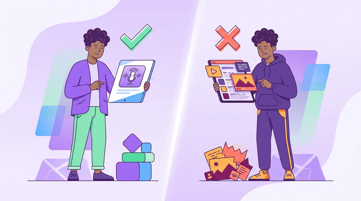
Run every cover against this before export. These are the rules that separate a cover that earns a tap from one that gets scrolled past.
Text
- Do keep it to your show name plus, at most, a three-to-four-word tagline. Two text elements, not five.
- Do use one heavy, bold typeface. Thin and script fonts vanish at thumbnail size.
- Don't put your episode number, host names, network logo, and a URL on the cover. None of them survive at 80 pixels, and they crowd out the one thing that matters: the name.
- Don't rely on tiny text to carry meaning. If a word is smaller than your show name, assume no one reads it.
Contrast
- Do build for high contrast, light text on dark, or dark on light, with real separation. Spotify's interface is dark, so light or bright artwork pops while a dark, moody cover sinks into the background.
- Do check contrast in grayscale. Desaturate the image; if the text disappears, your colors were doing the work the values should have done.
- Don't lay text over a busy area of a photo. Put it on a solid block or a darkened band.
Margins and safe zones
- Do keep important elements, show name, faces, logo, out of the bottom 15% of the frame. Apple Podcasts overlays a playback progress bar there during playback, and it will cover whatever you put underneath (Spotify and host-side guidance both flag this).
- Do leave breathing room around the edges. Some apps add rounded corners that clip the extremes.
- Don't push text to the very edge. A snug inner margin reads as designed; edge-to-edge reads as cramped.
Common mistakes (and the fix)
These five account for most rejected or invisible covers I see from new shows.
- Designing at the minimum. A 1400-pixel cover is accepted by Apple but looks soft on a smart-TV or car-dashboard display. Fix: always start at 3000 and scale down.
- CMYK color. Files exported for print use CMYK, which renders dull and shifted on screen and can get rejected. Fix: export in RGB / sRGB, every time.
- Transparency on Apple. A PNG with an alpha channel violates Apple's flat-image rule and may fail ingestion. Fix: flatten the background to a solid color before export.
- The over-stuffed cover. Show name, season, host photos, network mark, and a tagline all fighting for 80 pixels. Fix: cut to a bold name plus one short line, and run the squint check.
- Forgetting where it gets seen. A cover that wins on a portfolio page and loses in a feed. Fix: judge it at 120 pixels, not full size, that's the real audience view.
A clean cover is one piece of your publishing setup. The text surfaces around it carry just as much weight: tighten your reusable show-notes template so the description earns the tap your cover started, set up chapter markers your players will display, and run through every directory you should submit to so the same cover lands everywhere it should. If a directory ever shows the wrong image, the cause is usually upstream, check how your RSS feed references the artwork before you blame the file.
FAQ
What size should podcast cover art be? 3000 x 3000 pixels, square (1:1). That's Apple's maximum and the universal recommended size, and it satisfies Apple, Spotify, and YouTube from one file. Apple's minimum is 1400 x 1400 and Spotify's is 640 x 640, but designing at the minimum gives you soft art on larger screens.
What file format and size does podcast artwork need? JPEG or PNG, in RGB color, under 512KB. JPEG at 80-90% quality usually gets a photographic cover under the limit cleanly; use PNG for flat, hard-edged designs. Apple also requires a flat image with no transparency or alpha channel.
Can I use the same cover for Apple, Spotify, and YouTube? Yes. A 3000 x 3000 square in RGB under 512KB meets all of them. YouTube's channel icon is a separate, smaller 800 x 800 image that gets cropped to a circle, so design that one with your logo centered and padded, but your main square cover is shared.
Why does my cover look blurry? Almost always because the source file was small and got upscaled. Apps serve your art at many sizes, and a 1400-pixel or upscaled file goes soft on larger displays. Re-export from a true 3000-pixel original; never enlarge a small file to fake resolution.
Does cover art affect podcast discovery? Indirectly, and it matters. Your cover is the first thing a listener sees in a feed, a search result, or a social share. It matters most on visual-first platforms: 42% of US weekly podcast listeners use YouTube most often (Cumulus Media / Signal Hill Insights via Backlinko, Oct 2025), and on YouTube, the thumbnail is the click. A cover that stays legible at thumbnail size earns more of those taps.