
Why Podcast Reels Need Burned-In Captions


Burn captions into every podcast Reel, because most people watch with the sound off. Reported mute rates for social video run roughly 75–85% (Sharethrough/Digiday put it at 75% on mobile; Digiday, 2016 at 85% of Facebook video, both publisher-reported and directional), so an uncaptioned talking-head clip is silent to most of the feed. Burned-in text, not Instagram's optional auto-captions, is what carries the words when audio never plays.
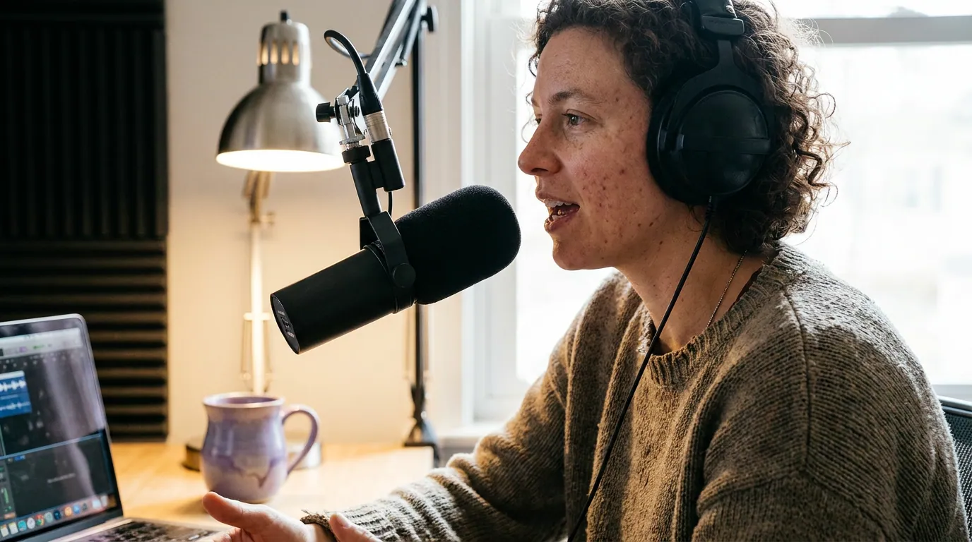
A podcast Reel is the hardest format to get away without captions. It is two people talking, no B-roll, no on-screen action. Mute it and there is nothing left to follow. The rest of this guide is the design part nobody tells you: how to style, size, place, and time captions so a thumb-scrolling, silent viewer reads the line, gets the moment, and stops.
Why do podcast Reels specifically need captions?
Because the format gives a muted viewer nothing else. A cooking Reel still shows hands and food on mute; a podcast clip on mute is two faces and a microphone. The words are the entire payload, and most viewers will never hear them, captions are the only way the content reaches them at all.
There is a discovery layer too. Video clips on social now drive podcast discovery more than friends and family do: 57% of listeners say they rely on social media for podcast recommendations, the first time it surpassed personal referrals (InsideRadio, 2025). Clips can account for 20–40% of a video show's new audience (Podcast Studio Glasgow). A clip that is mute and uncaptioned forfeits both, it cannot recommend a show it never communicates.
And captions are an accessibility floor, not a nice-to-have. Roughly one in five people lives with some degree of hearing loss (WHO World Report on Hearing, 2021), and far more watch in places where audio is impossible, a quiet office, a train, a baby's room. Burned-in text is the same fix for the deaf viewer and the commuter. You are not choosing between reach and accessibility; the same design serves both.
Burned-in vs. auto-captions: which to use
Use burned-in captions, text rendered into the video pixels, not Instagram's optional auto-captions or an uploaded subtitle file. Auto-captions only appear if a viewer's account setting turns them on, they render in Instagram's plain default style, and they vanish the moment a clip gets reposted or downloaded. Burned-in captions travel with the video everywhere, always on, fully styled.
| Caption type | Always visible? | You control the style? |
|---|---|---|
| Burned-in (in the pixels) | Yes, on every platform | Yes, font, size, color, timing |
| Instagram auto-captions | Only if the viewer enabled them | No, plain default look |
| Uploaded subtitle file (SRT) | Toggle-dependent, drops on repost | No |
The one honest caveat: burned-in captions are permanent. If they are misspelled or mistimed, you re-export the whole clip, there is no quick edit on the live post. So the accuracy check happens before you publish, not after. AI auto-captions get most words right but stumble on names, jargon, and crosstalk, which is exactly the vocabulary podcasts are full of. Plan to read every line once before it ships.
How to design captions a muted viewer can actually read
Keep captions to one or two short lines, in a heavy sans-serif, high-contrast, placed in the lower-middle third, with the spoken word highlighted as it lands. That single sentence is the whole job. The rest of this section is the why behind each part, tuned for talking-head clips where the text is the content.
1. Line length: one to two lines, ~6 words a line
A muted viewer reads in the gap between scrolls. Long lines lose them. Cap each line at about six words or 32 characters, and never show more than two lines at once. For a talking-head clip this also keeps text from creeping up over the speaker's face. If a sentence is long, break it into successive short cards rather than one wall of words.
2. Font and weight: heavy, plain, no thin strokes
Use a bold or extra-bold sans-serif, the geometric, high-x-height kind. Thin or decorative fonts disappear against a busy frame at phone size. Weight is what survives compression and small screens; a thin elegant typeface that looks great on your monitor turns to mush in the feed. Pick one font and use it on every clip so your show becomes recognizable at a glance.
3. Contrast: text must win against any background
Captions sit over a moving face and a shifting background, so the text needs a contrast guarantee that does not depend on luck. Two reliable options: a solid or semi-opaque background bar behind the words, or a thick outline plus a soft drop shadow on bright white text. White text with a dark stroke is the safest default because it reads over both light and dark frames.
4. Word-highlighting: animate the word being spoken
For talking-head clips, highlight each word as it is said, the spoken word changes color or scales up in time with the audio. This is the single biggest readability upgrade for podcast Reels, because it gives a silent viewer the pace and emphasis they would otherwise hear. It keeps the eye moving with the voice and marks the punchline. Keep the highlight color consistent (a single brand accent), and do not animate so aggressively that the motion fights the words.
5. Placement: the lower-middle third, inside the safe zone
Put captions in the lower-middle third, high enough to clear Instagram's own buttons and the username bar, low enough to stay off the speaker's mouth. The platform overlays its like, comment, share, and caption-text interface across the bottom-right and bottom edge; text that sits too low gets buried under it. More on the exact zone next.
What is the caption safe zone for Reels?
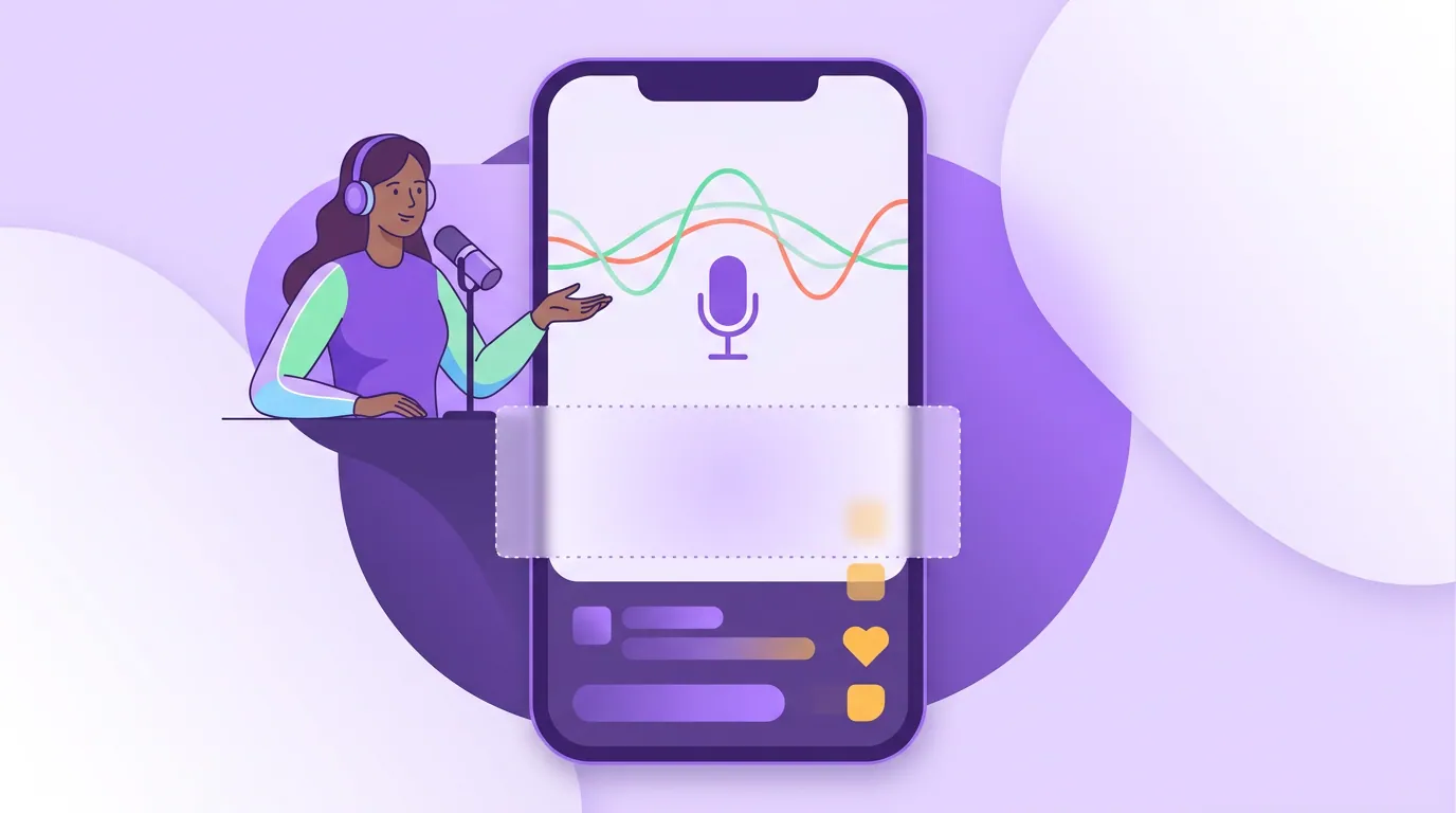
The safe zone is the central vertical band of the 9:16 frame where your text avoids Instagram's interface: keep captions out of roughly the top 250 pixels and the bottom 420 pixels of a 1080×1920 clip. Those edges hold the username, audio tag, action buttons, and the post caption. Anything important there gets covered on a phone.
A practical test: before you post, preview the clip full-screen on your own phone in the Reels viewer, not just on your laptop. The desktop editor does not show the buttons that will sit on top of your text. If a word lands under the share icon, raise the whole caption block.
Caption mistakes that quietly kill podcast Reels
These are the ones I see most on otherwise-good clips. Each has a one-line fix.
- Trusting auto-captions without reading them. Names, brands, and crosstalk get mangled, and a wrong word in the hook reads as careless. Fix: read every line once before export; correct names and jargon by hand.
- Captions over the speaker's mouth. Text on the face is the most distracting place it can sit. Fix: pin captions to the lower-middle third, above the bottom UI but below the chin.
- Too many words on screen. A six-line paragraph is a wall, not a caption. Fix: one to two short lines, swapped as the speaker talks.
- Thin font, no outline. It vanishes the second the background turns bright. Fix: heavy sans-serif, white text, dark stroke and shadow.
- No highlight on talking-head clips. Static captions give a silent viewer no pace. Fix: highlight the spoken word so the eye tracks the voice.
- Captions that run past the audio. Text that lingers after the line is said breaks the rhythm. Fix: time caption cards to the words, not to fixed intervals.
Style your captions once, save it as a template, and apply it to every clip. Consistency does two things: it speeds editing, and it makes your show recognizable in a scroll before anyone reads the handle. If you are still deciding the rest of your Reels approach, pair this with a Reels strategy for your first 1,000 podcast followers and the right clip length for Instagram, captions only matter on a clip people stay to read.
Frequently asked questions
Do burned-in captions hurt accessibility for screen readers?
Burned-in captions help muted and deaf viewers, but because they are pixels, screen readers cannot parse them. Cover both audiences by burning captions into the video and writing a real text description in the post caption and your show notes. The on-screen text serves the silent scroll; the written caption serves screen readers and search.
Should the captions match my brand colors?
Use a neutral, high-contrast base, white text with a dark outline, and reserve one brand accent for the word-highlight only. Coloring entire lines in brand colors usually drops contrast and hurts readability. A single accent on the highlighted word gives you recognizability without sacrificing the thing captions exist to do.
Are captions enough, or do I still need a written hook on screen?
They are different jobs. Captions transcribe what is said; a hook is a short text overlay at the top that frames why the clip matters in the first second. Strong podcast Reels usually have both, a hook to stop the scroll and captions to carry the conversation. See writing podcast Reel hooks that survive 3 seconds for the overlay side.
How accurate are AI auto-captions for podcasts?
Modern speech-to-text gets common words right most of the time but reliably trips on proper nouns, technical terms, accents, and two people talking over each other, the exact things podcasts are made of. Treat AI captions as a fast first draft you proofread, not a final output. The first three seconds matter most (castmagic); double-check the hook line especially.
Do captions actually increase reach, or just accessibility?
Both, indirectly. Captions do not flip an algorithm switch, but they raise watch-time on muted views, and watch-time is what distribution rewards. With most viewing happening on mute and social clips now the top podcast-discovery channel (InsideRadio, 2025), captioned clips simply hold more of the people who see them.