
Pinterest Pins for Podcast Episodes That Get Saved


A podcast pin that sends people to an episode is built as a search result, not a scroll-stopper: a tall 2:3 vertical image (1000x1500px), a keyword-first title overlaid across the top third in large readable type, a description written like the query someone would type, and a link straight to the episode or its show-notes page. Pinterest is a search engine that happens to look like a feed. Design for the person typing "morning routine podcast," not for the person idly scrolling.
That single reframe is what most podcast pins get wrong. They're designed to be pretty in a moodboard, when they need to be findable in a search and clear enough to earn the tap. Below is the design teardown: the layout, the title rules, the description anatomy, and a side-by-side of which pin styles get saved versus ignored, so your pins keep surfacing for months instead of sinking in a day.
Why pin design decides whether you get the listen
Pinterest behaves like search, which is the whole reason it's worth a podcaster's time. Pins have a shelf life measured in months, not the hours a TikTok or Reel gets, because people find them by typing a query long after you post. Your pin's job is to win that search result and then survive the half-second a searcher spends deciding whether to tap.
This matters because social is now where shows get discovered. 57% of listeners rely on social media for podcast recommendations, the first time it has passed friends and family (InsideRadio). On platforms built for scroll, a clip earns reach; on Pinterest, a well-keyworded pin earns intent, someone already searching for your topic. That's a warmer click than a random scroller, but only if the design answers their query at a glance.
If you haven't decided whether Pinterest fits your niche at all, settle that first, whether podcast clips actually work on Pinterest lays out which niches pull traffic (wellness, money, parenting, DIY) and which should skip it (comedy, news, gaming). This guide assumes you're in, and focuses purely on making the pin itself convert.
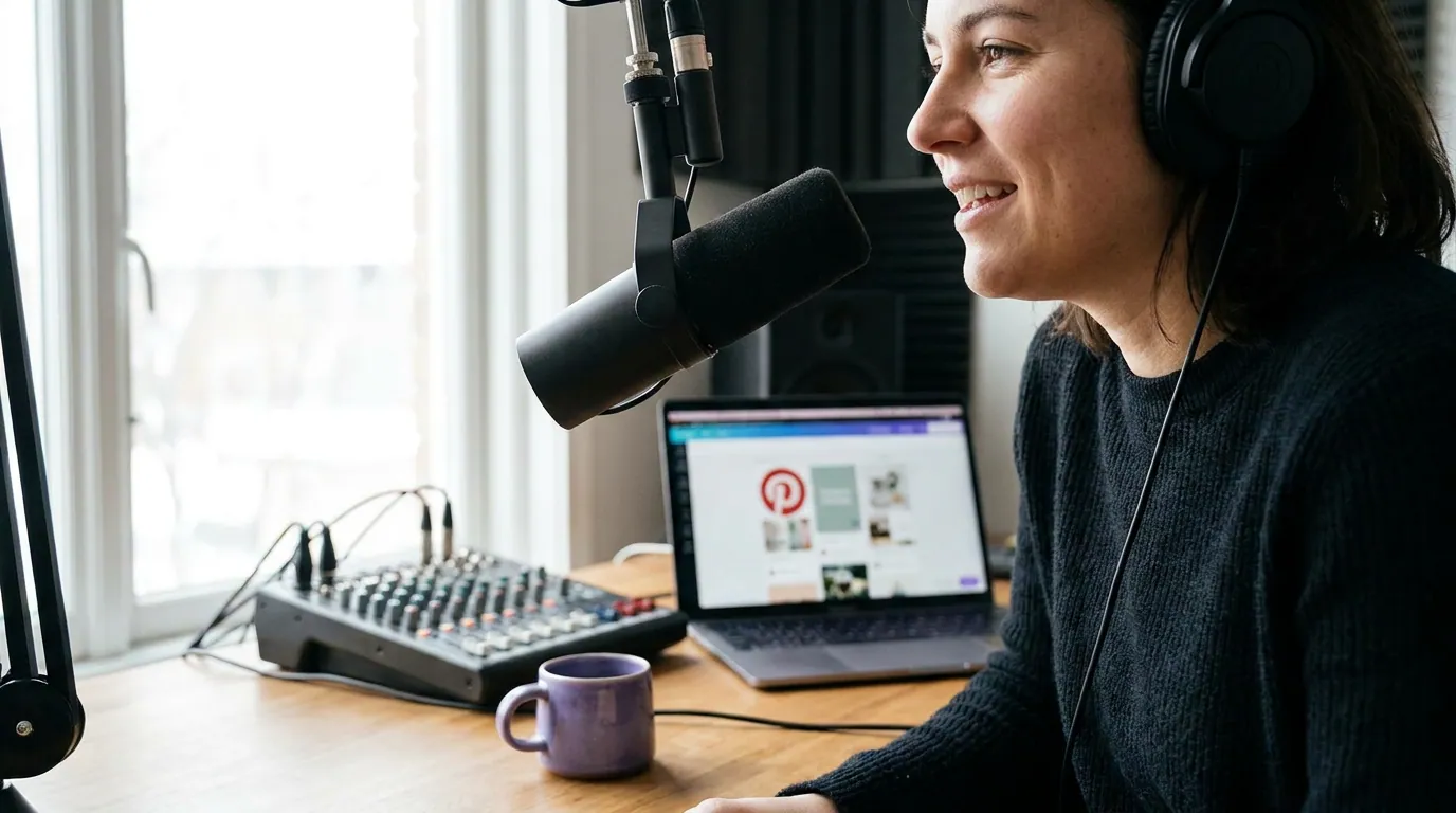
The three-zone pin layout
Every high-performing podcast pin is a 2:3 vertical (1000x1500px, the spec Pinterest favors) split into three zones. Title up top, a visual anchor in the middle, and a thin brand strip at the foot. The title gets the most space because it does the most work, both for the human skimming and for Pinterest's image-text reading.
A few rules that hold across niches:
- Aspect ratio: 2:3, 1000x1500px. Taller pins (like 1:2.1) used to win more grid space, but Pinterest now truncates the extra-long ones, so 2:3 is the safe default for both static and video pins. Anything square or landscape gets visually crushed in the grid.
- Title in the top third, at the largest size on the pin. It has to be legible as a thumbnail on a phone, not just on your desktop. If you can't read it squinting from arm's length, it's too small.
- One visual anchor, not a collage. A single guest face, or one clear object tied to the topic. Multiple images shrink each other into mush.
- Keep faces and text out of the bottom corners. Pinterest's save button and overlays sit there. Treat the bottom ~15% as a no-go zone for anything load-bearing.
Write the title and description like a search query
The title overlay and the pin's text description are two separate fields, and both should read like something a person would type into the search bar. This is the single biggest lever on a podcast pin and the one most creators waste on a clever phrase nobody searches.
For the title overlay (the words baked into the image), lead with the keyword and promise a payoff: "5 Signs of Burnout (Therapist Explains)" beats "Episode 42: A Chat About Stress." The first names a topic people search and a reason to tap; the second names your internal episode number, which no one is looking for.
For the text description (the caption field under the pin), write two to three natural sentences that include the keyword and a couple of related phrases, then a clear instruction to listen. Pinterest reads this text to decide which searches you rank for, so "burnout, signs of burnout, recovery, therapist advice" woven into real sentences does more than a wall of hashtags. A handful of relevant hashtags is fine; thirty is noise.
The pattern that converts: a keyword-led title overlay + a query-shaped description + a link to a page that delivers exactly what the title promised. Send pins to the episode or, better, a show-notes page that holds the listen and an email capture, the same logic as the Pinterest-as-search repurposing workflow, which routes every pin to a hub so high-intent searches become listeners instead of one-time taps.

Which pin styles get saved versus ignored
After looking at a lot of podcast pins, the ones that get saved and the ones that die share predictable patterns. The dividing line is almost never the photo quality, it's whether the pin reads as a useful search result or a promo graphic. Here's the teardown.
The honest caveat: a single pin's performance is noisy, and Pinterest gives you fewer reliable public benchmarks than YouTube or TikTok. So treat these as design principles, not a guaranteed save rate. Make ten pins to the right template, watch which keywords surface, and double down on the angles that get impressions, that's the loop, not chasing one "perfect" pin.
Common mistakes that make a pin disappear
These five show up on almost every podcast board I audit.
- Designing landscape, then cropping to fit. A 16:9 video frame jammed into a 2:3 pin wastes the format and shrinks your title. Build the pin vertical from the start, or reframe a horizontal clip to vertical so the visual anchor fills the middle zone.
- The episode number as the headline. "Episode 42" is a label, not a search term. Lead the title with the keyword and the payoff; put the number, if anywhere, in the quiet brand strip.
- A collage instead of one anchor. Three guest photos, two logos, and a QR code make a pin no one can parse at thumbnail size. One face or one object, high contrast, big title.
- A homepage link. A pin that ranks for "morning routine podcast" should land on that exact episode, not your homepage. Forcing a searcher to hunt for the episode kills the warm intent you just earned.
- One pin per episode, then done. Make three to five pins per episode with different title angles and visuals, same link, different searches. Pinterest rewards fresh pins, and you can't predict which keyword angle catches.
Send the click somewhere you own
A Pinterest tap is intent you rented; an email subscriber is intent you own. The version that pays off most routes a pin's link not straight to Spotify but to a show-notes page that holds both the player and an email capture, so a search you can't repeat tomorrow becomes a subscriber you can reach forever.
Pin the "5 takeaways from this episode" promise, deliver it on a page behind a simple signup, and let the rest follow. Then start a podcast email list from zero and put a welcome sequence for new subscribers behind it to carry that searcher into your back catalog. It's the same own-the-relationship move that makes a TikTok bridge funnel compound, Pinterest just delivers warmer traffic to feed it.
FAQ
What size should a podcast pin be? A 2:3 vertical at 1000x1500px is the safe default for both static and video pins. Pinterest favors tall pins but now truncates the extra-long 1:2.1 ratios, so 2:3 reads cleanly in the grid. Square and landscape get visually crushed and waste the format, build vertical from the start.
What should the title on a podcast pin say? Lead with the keyword and a clear payoff, in the largest text on the pin, set in the top third. "5 Signs of Burnout (Therapist Explains)" beats "Episode 42." It has to be readable as a phone thumbnail, and it should match a phrase a person would actually type into Pinterest's search bar.
Do podcast pins need to be video? No. A well-designed static pin with a keyword-first title often outperforms a video pin for podcasts, because the title does the ranking and the click. Video pins help where motion shows the payoff (a recipe, a workout), but the same 2:3 spec and three-zone layout apply either way. If you do go video, the first frame still has to earn attention, the same hook craft that holds a clip applies.
How many pins should I make per episode? Three to five, with different title angles and visuals but the same link. You can't predict which keyword angle will surface, and Pinterest rewards fresh pins over reposting the same one. Watch which angles get impressions, then make more like the winners.
Where should a podcast pin link to? To the specific episode, or, better, a show-notes page that holds the player and an email capture. A homepage link forces the searcher to hunt and bleeds the intent you earned. The pin makes a promise; the landing page has to deliver exactly that, in one tap.