
Leaving Room in the Frame for Captions


To frame a podcast for captions, keep the lower third of the vertical frame clear and put your face in the upper-middle, with your eyes around the top-third line and your mouth comfortably above where the caption band will land. Almost every clip you cut will carry captions, and on a phone those captions sit across the lower-middle of the screen. Compose so they fall into empty space, not across your chin.
Most framing advice stops at the host: headroom, eye line, how much of the frame your head fills. That is the right starting point, and we cover it in detail in the talking-head framing guide. But it skips the layer that almost every clip will actually carry. Captions are not optional on social video, most of it is watched on mute, commonly cited at 75–85% (Sharethrough found ~75% of people keep mobile video muted; Digiday reported ~85% of Facebook video watched without sound, both survey/publisher-reported and directional). If your composition fights the caption, you have framed for the wrong final image.
Where do captions go on a podcast clip?
Captions sit in the lower-middle of a vertical frame, roughly the lower third, but clear of the very bottom strip, where platform buttons live. On a 9:16 clip that means about 60% to 80% of the way down from the top. That is where the eye lands while reading, and the zone your composition has to leave open.
The reason captions don't sit at the absolute bottom is the platform's own interface. TikTok, Reels, and Shorts all stack buttons, the caption-author handle, the description, and progress bars across the bottom edge. Anything down there gets covered. So captions get pushed up into the lower third, which is exactly where a poorly framed seated host puts their chin and chest. The collision is structural, not accidental.
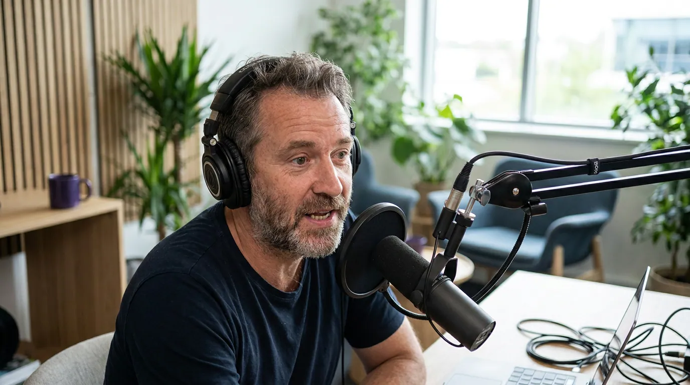
The four bands of a vertical frame
Think of a 9:16 frame as four horizontal bands, top to bottom. Each one has a job, and captions own one of them.
The headroom band gives the head a little air so it isn't jammed against the top edge. The safe face zone, the upper-middle, is where the eyes and mouth belong. The caption band is the lower-middle, where text will sit on most clips. The UI dead zone is the bottom strip that platform buttons cover. The takeaway is simple: your face wants the upper-middle, captions want the lower-middle, and the bottom belongs to the platform.
How much of the bottom does each platform eat?
Each platform covers a different amount of the bottom with buttons and text, pushing the caption band up. As a working rule, treat the bottom ~10–15% of a vertical clip as off-limits everywhere, and assume captions sit just above it. The exact amounts move whenever apps redesign, so check a current safe-zone overlay before a big launch.
Reels and TikTok are the worst offenders because they pile description text, music credits, and a tall right-hand rail near the bottom. Shorts is cleaner at the bottom but can drop a title card over the lower area. The safe play is to compose once for the most crowded case, Reels, and the same framing survives everywhere. When you crop a horizontal episode to vertical, the same logic applies; we walk through it in framing clips vertical from a horizontal podcast.

The chin-and-lower-third dead zone
The single most common framing mistake is centering a seated host so the chin and upper chest land exactly where captions go. When that happens, the caption either covers the mouth and jaw, the part of the face viewers watch most while reading lips on mute, or the editor shoves it up onto the cheeks, which looks worse. Both outcomes come from the same root cause: the face was composed into the caption band.
The fix is to nudge the whole composition up. Put your eyes near the top-third line rather than dead center, so your mouth sits in the upper-middle and the lower third stays open for text. On a vertical crop, that often means your head lands a touch higher than feels natural in the viewfinder, because the viewfinder shows the full frame and your brain wants to center the face. Resist it. You are composing for the final image with captions, not the empty frame.
Headroom versus caption space: the trade-off
Headroom and caption space pull in opposite directions, and the balance is what most guides miss. Too much headroom pushes your face down into the caption band; too little makes the shot feel cramped and still doesn't guarantee clear space below. The resolution is to give a little air above the head, then place the eyes on the top-third line, which automatically leaves the lower third open. Headroom and caption space stop competing once the eyes are the anchor, not the top of the head.
In practice, leave roughly a thumb's width of headroom above the hair on a vertical crop, enough that the head doesn't kiss the top edge, not so much that the face slides down. Then check the lower third is empty of anything you care about: a busy logo on a mug, a guest's hands, a desk plant. Whatever lives in the lower third will be partly hidden by text. If something important is down there, reframe or move it, because the captions are not negotiable and the object is.
This also changes how you set the camera distance. A medium close-up that fills the frame edge to edge with face works for a horizontal episode but leaves no room for captions once cropped to vertical. Pull back a little, or frame slightly higher, so there is breathing space below the chin. If you shoot two people, the math gets tighter still, both faces and the caption band have to share a vertical frame, which is part of why a single versus multi-camera setup and your two-person camera framing decisions interact with caption space.
A quick pre-record checklist
Run this before you hit record, framed on a vertical crop of your shot if your camera or capture app can preview one:
- Eyes on the top-third line, not centered. This pushes the mouth up and frees the lower third.
- A thumb's width of headroom above the hair, air, not a gap.
- Lower third clear of logos, hands, guests' shoulders, and clutter that captions would cover.
- Bottom ~10–15% empty, since platform buttons live there.
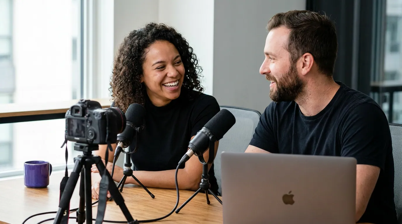
- Two people? Confirm both faces stay in the upper-middle when cropped, with the caption band shared below.
- Background contrast in the caption band: a busy background behind where text sits hurts readability even with a stroke or shadow on the caption.
If you nail the first three, you have solved the problem most creators only notice after they've published a hundred clips with text on their chin.
FAQ
Should I leave room for captions even if my episode stays horizontal? Yes, if you plan to cut clips, which is where most new viewers come from, short-form clips drive a meaningful share of new audience for video shows (Podcast Studio Glasgow). The horizontal episode can carry captions higher or lower, but the vertical clips you crop from it will put captions in the lower-middle. Frame the original so a vertical crop still has clear space there.
Where exactly should captions sit on a vertical clip? Roughly 60–80% of the way down from the top, below the face, above the platform UI strip at the very bottom. That keeps text off the mouth and out from under the buttons. Most clip tools default to about this position; the job of your framing is to make sure your chin isn't already there.
Can I just move the captions higher if my face is in the way? You can, but it usually looks worse. Captions above the mouth read as a banner stuck over the face, and they fight the eye line. It's almost always better to fix the composition, shift the head up, than to push the text into the upper frame.
Do two-person clips change the caption rule? They tighten it. Two faces plus a caption band have to share one vertical frame, so you have less vertical room to play with. Keep both faces in the upper two-thirds and accept a slightly looser crop so captions still land in clear space below both chins.
Getting your full shot dialed in first? Start with framing a talking-head podcast and the right three-point lighting setup so the caption band stays readable.