
Set Design That Makes a Podcast Look Like a Brand


Podcast set design that looks like a brand comes from repeating five small visual elements in every recording: one signature wall color, a sign or wordmark behind you, one recurring prop, a consistent light motif, and the same framing each time. None of it is expensive. The trick is treating the space behind you as a fixed identity you reuse, not a room you redecorate, so a viewer recognizes your show in half a second of a clip.
This is a brand lens on the part of production most beginners treat as an afterthought. You do not need a built studio, a budget, or design training. You need to decide on a handful of things once, lock them, and never quietly change them. Below is the five-element kit, the cheap wins that actually show on camera, the spends that do not, and a fast test for whether your set still reads at the size people watch on.
Why the look of your set is part of discovery now
The way a show looks on screen is part of how it gets found, because most people now meet a podcast through a short video on social feeds rather than inside a podcast app. 57% of listeners rely on social media for podcast recommendations, the first time it has surpassed friends and family (InsideRadio). Your set is what those feeds show.
It compounds with where attention already is: 53% of new US weekly listeners say they prefer to watch a podcast, up from 30% in April 2022 (Backlinko). When a stranger scrolls past three clips from three different shows, the one with a consistent, recognizable backdrop reads as an actual brand and not a webcam call. That recognition is what a set buys you. A clean, repeated look also signals the show is still running, useful in a field where a large share of podcasts quietly stop, so anything that reads as "this is a real, ongoing thing" works in your favor.
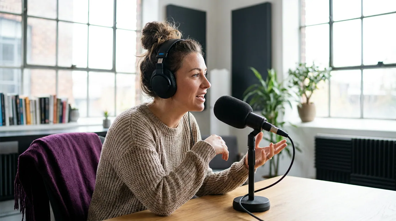
The five elements that make a clip recognizable
A set becomes a brand when five elements stay the same across every episode. Pick each one once, write it down, and treat the list as fixed. Consistency is the whole mechanism, a viewer learns your look by seeing the same thing repeatedly, so the worst move is changing the backdrop every few weeks.
1. A signature color
Choose one accent color and put it behind you, then use it everywhere else the show appears. Match it to your cover art so the feed, the thumbnail, and the set all agree, if your podcast cover art leans teal, the wall, a panel, or a colored light behind you should echo it. A single repeated hue is the cheapest brand signal there is. A gallon of paint, a fabric backdrop, or one color-changing bulb does it for under $40.
2. A sign or wordmark behind you
Put the show's name in the shot. A small backlit sign, a framed print of the logo, or shelf letters all work; the goal is that a viewer who pauses on a clip can read what they are watching without sound or captions. Keep it off to one side so it does not crowd your head, and keep it small enough that it reads on a phone rather than dominating the wall.
3. One recurring prop
Pick a single object that appears in every episode and becomes shorthand for the show, a branded mug, a specific plant, a colored notebook. It costs nothing if you already own it, and over months it does real work: regular viewers start to expect it. One prop is enough. A cluttered desk of "set dressing" reads as mess on camera, not as identity.
4. A light motif
Add one colored light in a fixed spot and hue, a practical lamp, an LED bar, or a glow behind the sign. This is the element that makes a home set look deliberate instead of accidental. Keep the motif separate from the light that actually lights your face: the colored light is decoration, your key light still has the only real job, making the face clear. If you are building the lighting from scratch, our three-point lighting guide covers the face first; treat the color as a layer on top, and a lighting kit for video podcasts gives you the pieces to do both.
5. Consistent framing
Lock the camera height, your distance from it, and the crop, then reproduce them every time. This is the element people forget, and it quietly breaks the other four, if the framing wanders, the same wall, sign, and prop land in different places each episode and the look never settles. Mark the camera and chair positions on the floor with tape. For the mechanics of where to sit and how to compose, see framing and composition for a talking-head podcast.
Cheap wins vs spends that don't show on camera
Set design rewards a few small purchases and punishes the obvious big ones, because the camera only sees a narrow cone of the room. The honest rule: spend where the lens points, skip everything outside it. Most beginners do the reverse, they buy a full studio and the camera captures four feet of it.
The cheap wins are the five elements above plus floor tape, together a few dozen dollars to maybe $150, depending on whether you paint and what light you buy. Industry cost guides put a whole hobby podcast setup at roughly $100–350 in one-time equipment (Ausha), and set design fits inside that without a separate budget line.
The spends that do not show on camera are where money disappears. Furnishing the entire room when the shot sees four feet of it. A second monitor the camera never frames. Acoustic foam bought for looks rather than sound, foam helps audio in a specific way, but it is not set dressing, and a clean accent wall reads better than a wall of foam tiles. The most common false economy: a camera upgrade in a dim room. A better body in poor light still looks worse than a phone in good light, so fix the light before you touch the camera. If you are pricing a first build at all, our first-time filming runbook walks the order, and a solid first mic under $100 does more for the show than any decor.

The clip test: does your set read at phone size
Before you call the set done, check it at the size people actually watch, a vertical clip on a phone, not the full 16:9 on your monitor. A look that works wide often falls apart cropped: the sign drifts out of frame, the color reads as a dull smudge, the prop disappears behind your shoulder. Pull one clip, watch it muted on your phone, and ask three things.
- Can you name the show from the still? Pause on a random frame. If the sign or wordmark is unreadable or cropped out, move it inward and make it bigger.
- Does the color survive the crop? If your accent color reads as gray in a vertical frame, it is too far back or too dim. Pull it closer or light it.
- Is the prop still in shot? Vertical crops the sides hard. If your recurring object lives at the edge of the 16:9 frame, it is gone in every clip. Move it toward center.
This is where most set design quietly fails. It is built for the monitor and watched on a phone. Designing for the crop from the start is the difference between a set that decorates your recording and one that brands every clip a stranger sees first.
Common podcast set design mistakes
Four mistakes show up in nearly every first branded set. Each has a one-line fix.
- Changing the backdrop too often. Recognition needs repetition; a new look every month resets it. Fix: lock the five elements and leave them.
- Cluttering instead of branding. A busy desk reads as mess, not identity. Fix: one recurring prop, a clear surface, nothing else.
- Coloring the light that lights your face. A colored key turns skin orange or green. Fix: keep the color motif as a separate light; the key stays neutral.
- Designing for 16:9 only. Edge elements vanish in vertical clips. Fix: run the phone-size clip test and pull everything important toward center.
Frequently asked questions
How much does podcast set design cost? Less than people expect. The five core elements, an accent color, a sign, one prop, a colored light, and floor tape for framing, run from a few dozen dollars to about $150, and they fit inside the $100–350 in one-time equipment a whole hobby setup costs (Ausha). The expensive part is usually money spent on the room outside the frame, which the camera never sees.
Do I need a dedicated studio room for a branded podcast set? No. A repeatable corner of a room beats a full studio you cannot keep tidy. The camera sees a narrow cone, so a single well-dressed wall, color, a sign, one prop, a light motif, is enough to look like a brand. Mark your positions with tape so the same corner reproduces every episode.
What is the cheapest way to make a podcast set look professional? One accent color behind you plus one colored light motif, both matched to your cover art. That combination is under $40 and does more for a "looks like a brand" impression than any single other purchase. Add a small readable sign next, and you have the core of a recognizable set.
Should I match my set to my cover art? Yes. Using the same accent color across your cover art, thumbnails, and set is what ties the feed together so a scroller recognizes the show in any format. Pick the color once when you design your cover art and carry it onto the wall and into the light.
Does set design actually affect podcast growth? Indirectly, and through clips. A recognizable set does not change your audio, but most discovery now happens through social video, 57% of listeners find podcasts via social media (InsideRadio), and a consistent look makes your clips identifiable in a crowded feed. The set is a discovery asset, not a vanity one.
Pick the five elements once, spend only where the camera looks, and check the set at clip size before you call it done. Record three episodes with the exact same look before you change a thing, the recognition comes from repeating it, not from building more.